
Ponderings after attending the Bologna Children’s Book Fair
In case you’ve come directly here from a Google search or link or something, you should know that I was only really popping into the Bologna Children’s Book Fair for a few hours, rather than full-on attending it (another time, for sure), because I’m (at the time of writing, of course) in the middle of a 5-week interrailing adventure around (some of) western Europe.
Random ponderings and notes
I overheard an illustrator managing to pitch to an art director on the bus! I can’t imagine having the nerve to that. Then again, a few years ago I hadn’t imagined being able to email art directors with my work and now it’s pretty much a built-in habit.
The fair itself felt quite overwhelming, as book fairs tend to for me (been to my fair share over the decades – in fact, I met my husband at the Frankfurt Book Fair, which I always think sounds cool!). Illustration, unsurprisingly, has a really big place at this one, though, whereas I think that’s definitely less so at London and Frankfurt and Paris (unless I’m not looking in the right places).
The illustration wall (s – there were a bunch of them) was immense. So much amazing art on there and such a wide variety of styles. There were also many displays up of illustrations that had won various prizes (I can’t keep track of all the different prizes) or in specific sections.

I couldn’t work out, in the moment, whether to feel very inspired or completely daunted by the huge amount of truly stunning illustration and the number of illustrators there looking to get work. With hindsight I am choosing inspiration, because that is the more positive and constructive one (not from any logic).
I went and said hi to someone I’m working with currently, which was nice. And, as my husband reminded me when I chatted to him later that day, I was one of the illustrators with work on display and being pitched at Bologna, which is pretty cool.
I took quite a few photos of the names of publishers that ‘called out to me’. I’m hoping they were calling out because they felt like somewhere my style would fit, and not just because I loved the work. Though surely it could, or even should, be both?
I did not go with the plan to pitch at all. I think my portfolio currently is still probably skewed toward illustration for adults, rather than children, and I would want to have more children-focused pieces in there if I did. I did load up my portfolio on the iPad, just in case, but it didn’t come up and I definitely didn’t go stand in any portfolio review queues, though I really love how many there were around and I would totally plan to do so if I were to (WHEN I) go ‘properly’ (aka not while in the early stages of a 5-week interrailing trip round Europe!).
I did sit and listen to a couple of talks. One by the art directors from the Folio Society (actually quite fortuitous to come across that, as they are adult-focused rather than children- and they run a very good, and free-to-enter competition). That was interesting. Another was by an illustrator (Loes Riphagen) about her process on a book, which was great (love to find our more about others’ processes).
The atmosphere was buzzing for sure. I think, if I go next year or the year after, I would:
- book accommodation early and in Bologna.
- aim to book AirBnB (or similar) so I could cook and wind down well
- maybe consider sharing a flat for the week with one or two other Illustrators, so we could go round together a bit
- put together a children-focused portfolio that really shows characterisation, scenes, movement, versatility (and probably some other things!)
- get some postcards printed (or maybe something more exciting than postcards?)
- have something ready to go up on the illustrators’ wall
- go to portfolio review open calls
- buy some books (couldn’t do that this time, as have a 30-litre backpack to take me through the five weeks).
I would love to hear others’ experiences of the Bologna Children’s Book Fair, either this year or in previous (or future) years. If you’ve written a post about your experience, drop a link in the comments! And let me know if you’re planning to go next year.
What makes your heart sing?
Have you worked out what makes your heart sing yet? I actually think this is something that is probably continually evolving for most of us. It’s certainly changed throughout my life, but even changes a bit from day to day or different times of the day.

I think people who find this out early on and stick with the same thing through multiple decades are probably quite rare. (No empirical evidence of this, though; it’s purely based on my own ponderings, experience and chats with friends, so would love to know whether others agree!)
Some things have always called to me, though, and never stopped. Books and drawing of some kind or another are probably my forever things. I’d also probably say languages and travel, but I don’t think they’ve fully stuck throughout my life.
Most of my life, my career has been in books (though encompassing digital publishing of various kinds as time went on) and I love that my more recent illustration career has overlapped with the publishing world, because I don’t think I would ever want to leave books behind completely (though, obviously, I’m never going to stop reading them).
(SIDE NOTE to any art directors in the book publishing world – I think I’m about ready for another chunky book illustration project, so give me a shout if my style fits your requirements.)
Anyway, there’s a little Sunday introspection for you. I’d love to hear what you think. Do you have some forever things that have always called out to you? Do your passions change with the seasons or the decades? Have you been able to find a career in some aspect of what makes your heart sing?

PS You may have noticed there are three versions of this hand-drawn type piece. I’m making a point, now and then (not for EVERY illustration, as that could be a bit time-consuming), of rejigging an illustration into different formats, or planning out different formats from the start. I think this is something that’s quite useful for commercial illustration – for example, different formats for social media, a thumbnail format and a full-page format. So, if you’re commissioning me and this sounds helpful, do ask about getting an illustration in different formats.
Working from home
Working from home? Is it like Marmite (that may be a UK-centric question)? Love it or hate it?
I have worked from home (apart from a six-month stint in-house nine years ago) since 1999. And, unsurprisingly, I love it.
I love that I don’t have to worry about the weather, spend hours on a bus or train, wear makeup, straighten my hair (obviously I shouldn’t have to do either of those two, but… yeah!) …
I love that I get way, way more work done than I ever did in-house, because I’m not constantly being interrupted by people talking to me (I know, lots of people love that. I don’t.) and my days aren’t filled with meetings (though, the pandemic has meant there a lot more of them, but at least they can be done via Teams now and not require a whole day away from my desk to get to sit talking in a conference room for a couple of hours – though I do miss the excuse to bunk off for the rest of the day and wander round the V&A or my old stomping ground of Oxford).
I love that I can go to my kids’ summer concerts, art exhibitions, shows, etc. without having to book off half a day. I love that I can start at 5am and finish at lunchtime, or work a couple of hours in the morning and some more after the kids are in bed. (Even though, for the most part, I stick to 8–4 and enjoy hanging out with them before and after school.) I love that I can take my laptop and/or iPad away with me, so I can do a bit of work while also having a change of scenery and explore.
I love that I can take my lunch in the garden, watch a film in the middle of the day (I literally never do that, but I love that I can), hang the washing out when I need a break from my desk…
Oh, and I very rarely find myself wandering off to the fridge for cheese.
So do you love it or hate it? Do you want to be able to work remotely as much as possible, or would you rather be in the office all the time? Enjoying a mix of both?
I’m a little intrigued by the possibility of becoming a remote employee, or a hybrid employee. But I think I still probably need to be my own boss. I am very grateful, though, that there seems to now be much more opportunity for those of us who do love working from home.
Lifestyle illustrator: Hand-drawn type and drawing words
I have always loved decorative type – from delicate, swirling calligraphy, through neon bubble writing, spray-painted graffiti and colourful mixed-up fonts, to ornate chalkboard writing. And, my absolute favourite …

I absolutely love the loose, handwriting-style that I can get from a dip-pen or fountain pen – or, more often, my Apple pencil! I like mixing up lower-case and capitals, and throwing in some font-like letters here and there. (I do have to switch off the editor in me, because she can get a bit antsy when I go all out with mixing up lower- and upper-case.)
Hand-drawn type (mostly) on its own
I use hand-drawn type a lot. I use it on its own for positive, life-affirming messages …


… or shouty activism (yeah, I need to do a lot more of this one!) …


… or celebratory words …


Hand-drawn text within illustrations
I use it within illustrations a fair bit. On bottles and packaging or wall art …


… in the words for my alphabet series …


… as captions on individual spots …


… as text in speech or thought bubbles, or not …


… in illustrated recipes …


Hand-drawn type within patterns
I even use it in patterns sometimes!


Hand-drawn type on book covers
Oh, and of course for book covers.

Do you love

too?
What’s your favourite decorative type, illustrated words, hand-drawn text (…)? Leave a comment and tell us what you love about illustrative text. Or link to some of your own hand-drawn type, if you like!
If you’re looking to commission some hand-drawn type, do get in touch!
NEWS: List Happy by Vanessa King, illustrated by Tasha Goddard
Exciting news! At the end of last year and the start of this year, I was very busy creating lots of illustrations for this lovely book List Happy, which is written by Vanessa King and illustrated by Tasha Goddard (that’s me!).
While I’ve had illustrations in books before, this is the first with my name on the front cover, so it’s especially exciting for me. The book will be published, by DK on 28 June 2022, in the UK and the US.
And here’s the cover – and, yes, that’s a tonne of my hand-drawn type.

The blurb
Improve your mental health by finding joy, gratitude and happiness in everyday things.
We have so many good things in our lives and yet much of the time we fail to notice them. But taking the time to think about the small, everyday things that bring us joy and make us thankful can have a huge impact on our mental wellbeing. What better way to boost your mood than to spend time listing all the good things around you? Where are the places that you feel most at peace? What music brings you joy? Who are the people who have made a positive difference in your life? What challenges have you overcome and helped grow your resilience?
In this beautifully illustrated book, over 75 lists guide you on the path to a happier life, including quick lists to help create mindful moments throughout your day and action prompts to further your positivity journey.
Choose a list at random or work through them one by one. Whenever you’re in need of a boost, you can come back and add new things or remind yourself of encouraging thoughts and reminders you’ve written. List Happy is the perfect way to take time out for yourself, focus on the here and now, and remember all the good things in life.
Spreads
Here are a few spreads from the book.


Some of my favourite artworks in the book
I loved all the artworks and it was wonderful to get to illustrate in my bright colours. There are chapter openers, half-page illustrations and then lots of other illustrations of a variety of sizes through the book, with spots throughout. 190 illustrations in total!
It’s really very hard to pick favourites, but here are a few that I particularly love!


Process
I did all the work for this book in Adobe Fresco and handed files over as Illustrator-editable PDFs that Fresco will save out.
Each of the main artworks would start with a brief, which would usually be fairly simple, and would mention anything essential that had to be include. I would then draw a rough.

Sometimes there would be feedback and changes on the rough, while some would be ready to colour. Once the roughs were approved, I then laid down the colour. Sometimes there were changes after the colour was finished, too, though less than at rough stage, as I do fairly detailed roughs.

Most of the spots were drawn straight to colour, and some of them a number at a time and then extracted into their own files.
Pre-order the book
I can’t wait to get my copies of the book – not just to see me artwork in it, but because I’m really looking forward to going through it and learning from Vanessa’s extensive experience and get better at noticing all the good things.
You can pre-order the book now from:
Or why not ask your local independent book store to order a copy in for you?
I’d love to know if you do buy a copy, and if you have any favourite artworks from it.
Lifestyle illustrator: Illustrating everyday objects
My sketchbooks (and possibly even more so, my notebooks, as I HAVE TO doodle while planning, listening and so on) are full of quick little sketches of mugs (lots of mugs, to be honest) and lamps, and pens and scissors. (They’re also full of flowers and weird and quirky faces and folk-art style kinda symmetrical patterns. I should maybe do a whole blog posts on sketchbook, notebook and random post-it doodles.)
If in doubt, just draw what’s in front of you. To I almost always have a huge list of ideas of things I want to draw or sketches I’ve done that can be worked up to final – not to mention actual client work with specific things to draw. But there are still times when I’ll sit in a café or on a park bench and pull out my sketchbook and not know what to draw, but want to draw something. And there is literally ALWAYS something there to draw, so we can never really have the excuse of not knowing what to draw, can we?
I think I probably claim a lot of things are my favourite thing to draw, but I definitely have an overriding joy of documenting the everyday. That can be documenting emotions and scenes, but it is often just capturing the handful of things I can see on a shelf or the random collection of junk sitting in the corner, or the bits and pieces sat on top of the cupboard… Oh!! I knew there was a reason to be a cluttered, not overly tidy person! Because I do think it’s generally far more interesting to draw a busy and cluttered space than a clear and clean shelf with nothing askew at all.
Sketchbook glimpses of everyday objects
Here are a handful of sketches and doodles of everyday objects from flicking through some of my sketchbooks and notebooks and the piles of post-its on my desk (yes, it’s a messy cluttered desk, obviously… even when I tidy it, it will still be pretty cluttered).

Drawing challenges
I do (start, at least) a lot of drawing challenges, whether ones I make up for myself, ones that stem from a class or membership I’m part of, or just big global Instagram challenges. I’ve found I’m most happy to do ones that last around a month, as I get bored if I try to go up to 100 days. Quick-draw daily challenges are great for a bunch of things – practising something you’re rusty at drawing, leaning into a new style direction, or just flexing your muscles in a different way to the client work you’re working on.
Last year, I did a lot of A to Z challenges, including an A to Z of Everyday Life, and an A to Z of Household Objects (didn’t finish that one because I had client work that required some long hours).


I also did around a month where I drew a particular subject matter on different days of the week (and one day was objects).


Illustrating everyday objects within scenes
The sketching and doodling and the drawing challenges all feed into final illustrations, whether personal work or client work. Including those little details in room illustrations, like a glass of water, pair of glasses or inhaler, or putting stuff on shelves in the background of illustrations of people interacting or doing things, makes all the difference, I think. And the inclusion of everyday objects can make illustrations more relatable and also tell a story.
Here are a few where you can see a variety of everyday objects.


List of things to draw
It’s really handy to have a list somewhere (on your phone is probably easiest?) of everyday objects to draw, so you’re not always limited to what’s in front of you. Most of them you should probably be able to draw from memory, but you can always look up some references if you need to. Here’s a short list of ideas you can use if you like – or come up with your own list. There are 31, so you can use if for a month-long challenge if you want to.
31 everyday objects to draw

And here they are in text, so you can copy and paste them if you like.
- Mug
- Teaspoon
- Bar of soap
- Shampoo bottle
- Whisk
- Kettle
- Pair of scissors
- Headphones
- Mobile phone
- Sketchbook
- Sandal
- Broom
- Trowel
- Clothes peg
- Washing powder (or liquid or sheets)
- Microwave
- Watering can
- Toilet brush
- Hairbrush
- Toothbrush
- Washing-up brush
- Pencil sharpener
- Lanyard
- Teapot
- House key
- Spanner
- Measuring tape
- Bottle of sanitiser
- Face mask
- Nail varnish
- Purse
Life as an illustrator: My illustration process
NOTE: There’s a lot of video in this post, so it may take a while to load for you!
Since quite a few people who read this blog are illustrators and because I love reading other illustrators’ blog posts about their process, I thought I’d start a series of posts about being an illustrator, to intersperse with the posts about the different things that I tend to illustrate. I am fascinated at the glimpses we can get into different illustration processes and love seeing timelapses popping up on my Instagram feed or watching some of the videos other illustrators share on their Patreons or blogs.
This isn’t for the purposes of copying them, but just to get an insight in different ways to go about things, I think. Sometimes you’ll see a really useful shortcut or tool you’ve not fully explored. Other times you’ll just appreciate the differences and understand that, while you love a certain illustrator’s work, their process is not one you’d want to explore – perhaps because it takes too long, or because it feels too repetitive, or because it doesn’t give the opportunity for looseness and embracing mistakes, or because it’s too digital, or too messy and requires a bigger working space than you have …
So, when I’m sharing my process here, it’s for the same purpose – perhaps you’ll spot a neat little trick that you hadn’t tried before, perhaps it will help you understand that you prefer proper paints and pencils, perhaps it will make you try out Adobe Fresco and find something you love in there… Or perhaps, you’ll just enjoy a little glimpse into another creative mind. How lucky we are these days to be able to see into so many different creative minds around the world.
Sketching
I almost always start with sketching and I almost always do that sketching on the iPad. I work on an iPad Mini (5, with Apple Pencil first generation), which is really very portable (it fits in my small bag along with a notebook, mini sketchbook and a pen and pencil – and my purse, phone, a couple of masks, a reusable tote bag with a beautiful pattern on from the V&A, my inhaler, my house key, and usually a hair band or two!). I might one day by a bigger iPad and possibly a Pro, but for the moment I can do everything I want on the dinky one.
And I do the bulk of the work in Adobe Fresco (sometimes absolutely everything, in fact). When I sketch in Fresco, I sketch with the pixel pencils and my favourite is the charcoal pencil, which I *think* is one that comes with Fresco, but it *might* be a Kyle Webster brush as I do have a bunch of them downloaded. If you didn’t know this already, Adobe Fresco allows you to work in both pixel and vector and you just have different layers for each. Some illustrators make great use of this by drawing flat vector style work and then adding pixel texture in. I just use the pixel for sketching and the vector for final. It might be that I’ll explore using pixel texture in future, but for now I prefer a flatter style and adding any texture with pattern or mark-making (but still vector).
I used to draw directly into Photoshop on a Microsoft Surface or Wacom Cintiq, and I do still sometimes use both to draw in Fresco, but rarely to draw in Photoshop anymore, just because Fresco and the ability to draw in vector and have a loose hand-drawn look that is still a non-destructive vector is far preferable to me. It’s very likely I’ll adjust my process and style down the line as I think we tend to always be growing and adapting our processes and styles. But for now Adobe Fresco is perfect for me.
So, I’ll start with sketches:


Some sketches are super quick to draw, some take a few iterations (especially if it’s client work, where they might realise they need some extra bits, or to change the composition, and so on, though I also like to sit on a sketch for a few days if I have time, because then I will often spot tweaks to make or potential for rejigging the composition) and some take quite a while, especially when they incorporate a whole scene. My sketches are almost always in layers, so that elements can be moved around. Sometimes I merge a sketch down before starting to colour, especially if it’s very complex, as it can slow down the iPad if I don’t. But I prefer to keep the sketch layers, if I can, as then I can hide everything I’m not currently drawing in colour so as not to distract.
Here are a couple of sketch process videos:
Sketching is almost always the part of the process that takes the longest. It can often also include researching reference images, too. Sometimes I’ll gather a number of photos of people in a particular kind of pose or, if I need to draw a specific flower or an animal, I’ll gather a number of photos and then draw based on a combination of what I see in those photos. I would very rarely draw directly from a photo without making a good number of changes. Often, when sketching a scene, I will mess around with the composition and scale quite a bit before feeling happy with it. I tend to do sketching with silence or a particular music that fits the feel of the piece. It’s concentration work in a similar way to editing (with my educational publishing hat on).
Adding colour
I then usually group the sketch and put it on top with a multiply blend mode, so that the sketch will appear on top of what I’m drawing. And then I go in and draw all the elements bit by bit – again, everything is kept in layers, and I group the layers together, so that each person will be a whole group (and they probably have their head and hair as a group, their legs as a group, etc.
I use flat colour and I tend to draw with a customised vector brush (sometimes I use the new manga brushes too, which can be quite nice), but mostly I use my default customised brush. (Roundness = 50%, Angle = 90°, Taper Mode = Velocity, Begin and End Taper = 0%, Pressure dynamics = 100%, Velocity dynamics = 0%)
I have a library with my go-to colours, which I update now and then (I recently added quite a few more pinks and blues, but I’m feeling the need for a few more greens, too). Keeping a consistent colour palette (which tends toward a lot of bright colours, as you may have noticed!) is definitely a part of my style. I will sometimes pull out a handful of colours for a limited palette, but they will still come from my default colour library. And, as it’s a Creative Cloud library it’s available to me within Adobe Fresco, whether I’m on the iPad, my Surface Book or on my desktop and using the Cintiq. (And it’s also available in the desktop Illustrator and Photoshop apps, so I never have to guess or eyedrop.)
Here are a couple of process videos showing the colouring stage:
Colouring is usually less time-consuming than sketching, though for some particularly complex pieces it can take longer. Sometimes you can cut some time by duplicating elements – for example, in the garden scene above a number of the flowers are used multiple times. Colouring can be quite a mindful and calming part of the process, but it’s also a less brain-heavy one, which means I will often do it in front of the TV or listening to podcasts. Sometimes the colouring can get a little tedious, so having something else to concentrate on helps.
Going straight to colour
Very occasionally I will draw straight to colour, using the vector tools, without sketching first. I’d really love to be able to do this more, as it would speed my process up a lot, but I’m not sure I’d want to let go of the sketch stage for client work, because so much can get decided there.
Here’s a process video of one that I went straight to colour on. I do like this one and can see the potential, so may try to do this a bit more often with personal work going forward to see if I can’t streamline my process a bit more. And I do think it retains a bit more looseness that sometimes is lost with the sketch and then colour process.
Notes about finalising
One thing to watch out for in Fresco is that you might end up with what looks like a single piece of flat colour, but it’s actually got multiple fragments of the same colour. While it’s not a huge problem, I try to consolidate them as I go, because it can keep the file size down and helps if you are going to take the final files into Illustrator to tidy up and finalise (e.g. if you’re going to be uploading to a stock site you would be best doing that or it might get rejected and, for client work, the in-house designer may well need it in as clean a state as possible).
The other thing to watch out for (though note that I haven’t tested this in a while, so it might have been sorted in a recent update) is that if you use clipping layers on vector Fresco will spit them out as pixel layers rather than vector. Which is why I manually delete the edges of texture etc. rather than just clipping it (which would be way quicker and easier!).
Currently, you can’t name your layers in Fresco, and I’m very big on properly organised and labelled final files, so my preference, if there is time, is to finalises in Illustrator (or Photoshop, depending on client requirements) and tidy up and consolidate and group everything and name the layers. Note that currently you can save as PSD or PDF (but the PDF is an Illustrator-compatible file). There’s an annoying thing that all the layer groups, when you open in Illustrator there’s always a weird empty clipping layer that serves no useful (that I can see anyway – any Adobe Fresco experts, do tell me if there is a purpose!) purpose. If you find one of these and select it and then select all with the same appearance you can get rid of them all in one go.
If I’m just supplying straight from Fresco (either saving out as PSD or the Illustrator-compatible PDF) I’ll still do a certain amount of tidying before handing the files over. I’ll usually remove the sketch layer(s). I’ll make sure that all the elements are grouped sensibly (as I usually do this as I go along it’s just a case of checking I haven’t missed anything out). I’ll check for any hidden layers and see if they should be visible and, if not, delete them. I’ll also check for any stray colour elements (see above) – if you try to fill with a different colour and it doesn’t fill the whole space you can tell it’s not consolidated. If you fill it all with the same colour and then double-tap with the fill tool that usually does the trick. If it’s a single motif or element, rather than a full scene, I’ll make sure to remove the background layer.
And then I’ll file everything away in the right folders and save the final files to a specific folder in Creative Cloud, which I’ll then send a link to the client so they can pick up the files from there. I usually have folders for roughs, final sketches, colour, final colour and final files. I’ll keep all the in between folders and files in Fresco (Creative Cloud saves them in the cloud anyway) and just put the final files and JPG/PNGs of the sketches in the main project folder. I try to keep Fresco organised into folders, though I do often just pick it up and create a new file without putting it in the right place, so do have tidy it up every so often. (I haven’t got to the point of archiving old Fresco files, but I imagine I will run out of Creative Cloud space at some point and need to do that, at which point I’ll have to decide whether or not I want any of those in between files. If I’ve saved out a final Illustrator or Photoshops layered file, and have JPG/PNGs of the original sketches, it’s almost certainly not necessary!
Thank you for reading and watching!
I hope you’ve enjoyed this glimpse into my process. In the future I might do a screen recording of me drawing in Fresco on the Wacom and talking through it as I go. But I need to sort out the right software and also have some time where I can sit recording with no-one else in the room, which is not something that can happen very often, due to sharing my office space with my husband.
If you’re an illustrator and have shared your process in a blog post or YouTube video, pop a link in the comments. I’d love to have a nosy!
Lifestyle illustrator: Illustrating people
Drawing people used to be something I shied away from, concentrating more on flowers and objects. Because drawing people feels like something that requires more responsibility – representing the diversity of human life and somehow giving as many people as possible an image that they can relate to in some way. Because, well, it’s hard and takes practice and a lot of observation.
But now? Drawing people really is one of my favourite things. While I do still default to drawing women of probably around my own age, I have started drawing more men and I am working on including a variety of body shapes, as well as continuing to ensure I draw a diversity of ethnicity (and not just by changing skin colour and keeping everything the same). And I love continuing to grow in how I draw people – finding new ways to stylise, drawing more postures, drawing people moving more, digging deeper with clothes and they sit…
Illustrating women
I think it’s safe to say that I draw a lot of women. My defaults if I’m not sure what to draw are a stylised flower of some kind or a woman (and usually that woman will be white and of a similar age and build to me, because really my default is an unconscious self-portrait (and I love flowers).


Illustrating groups of people
Thankfully I get asked to draw a variety of people, and I also set myself briefs to ensure I don’t just draw women. Illustrating groups of people or drawing scenes with quite a few people in, are great fun, and it’s good to get the opportunity to draw a wider diversity of people.


Illustrating scenes with people in
I enjoy illustrating scenes, though obviously they can take quite a long time, because adding in all the little details is great fun. And, as with illustrating groups, you can look to include some diversity and see how far you can escape stereotypes.


Illustrating children
I definitely tend to draw more adults than children, but I love getting the opportunity to draw more and find it fascinating how the proportions change with age, as well how much diversity you can get in a single small class of children, even just in terms of height and body shape.


Illustrating teenagers
Illustrating teenagers and tweens is fun, because they’re closer to adults, and therefore fairly similar in proportions, but they often have fun clothes or accessories to include! Plus, they are all freaking amazing! (Not just saying that because mine are that age. Nope.)


Illustrating men
Yeah. I definitely need to draw more men! Other than within groups I have barely any drawings of men. I have this guy, who is supposed to represent the patriarchy. My dad who I drew for his birthday this year. This random dude (found this in my ‘daily drawing’ files and don’t know if it’s supposed to be anyone in particular).


Hope you’ve enjoyed looking at this selection of illustrated people. If you have a project that includes illustrating people, and you like my style, do get in touch! And if you’re an illustrator, I’d love to know if you have particular types of people you prefer to illustrate and if you challenge yourself to draw the ones that you don’t default to.
Lifestyle illustrator: Illustrating rooms
I think drawing rooms has become one of my absolute favourites. (Though I realise I probably say that about a lot of things, and my favourite may change depending on what I’m doing the most of at any one time – usually the thing I’m in the thick of is the thing I feel happiest about, but occasionally, if I’ve agreed to draw something that maybe isn’t really ‘me’ I might be feeling it’s the least favourite.)
My love of drawing rooms goes way back to when I was a kid of seven or eight years (I know this because I remember it being after moving house, which we did when I was seven, and before we went to live in Spain for a year, which we did when I was nine). I spent hours drawing bathrooms. Every piece of paper I could get my hands on – including the backs of envelopes and cereal boxes – I drew bathrooms. They frequently had naked women in them too – I assume because you do usually have to take your clothes off in a bathroom, not for any other nefarious reasons! I also remember that I would almost always include a shower in these bathrooms, even though we only had a bath in our bathroom, because I loved showers and really wanted one. (I do have one now, thankfully, and am very very grateful for it, because it is responsible for making me feel awake and ready to face the day.)
Illustrated bathrooms
So, no surprise that I have drawn a fair few bathrooms (and showers, and toilets…) Anyone out there looking for an illustrator to create a book of bathroom illustrations? I’m sure there’s a nice market for that somewhere.


Illustrated living rooms
The living room can be a real window into the soul of a family. And I love adding in lots of little details that give clues to the family who hangs out in my living room illustrations. You may notice that my rooms are all fairly maximalist. And anyone who’s been to our house will not be surprised about that! That said, I do tend to draw rooms that have a bit more of an organised maximalism than is present in our house – perhaps they are wishful thinking rooms. And perhaps one day I’ll repaint the walls and neaten up the bookshelves and hang that gallery wall I’ve been wanting for ages, and put up the cute little mini shelf units I bought more than a year ago and… Or maybe I’ll just keep drawing the living room I want and somehow use that to manifest it, without actually having to do any work?


Illustrated kitchens
Kitchens are also (or sometimes more so) the window into a family life. Our kitchen is tiny, but our dining room is kind of an extension to it and we do spend a decent amount of time around the table (though less and less as the teen and almost teen have their own commitments). We aim to eat dinner at the table every day, and maybe succeed four or five days a week. When I draw kitchens, some elements will be based on our life, but I’ll also sometimes throw in some wishes, too. Though one of these kitchen illustrations is more of a feeling of a kitchen, and not quite as maximalist as my usual.
My ideal kitchen is a large one with a big range cooker and huge fridge freezer and lots of beautiful pots and pans and crockery and a really big farmhouse dining table and a double butcher sink (that I really don’t want to call a butcher sink, now I think about it!) and maybe even a sofa. A proper full-on living kitchen where everyone hangs out. Since it’s not too far off nest-flying time, I think that’s probably a wish that will stay unfulfilled. Would be a bit ridiculous to get one when there are only two of us to make use of it!


Illustrated bedrooms
When I was looking through my work to find pieces for this blog post, I was surprised to find that I hadn’t drawn any bedrooms. So I devoted some of my free drawing time over the past week to drawing this bedroom illustration. Again, it has some basis in our bedroom (though doesn’t show the other side of our bedroom, which is our office space), but also tells a bit of a story through some of the details, I hope.

Illustrated reading spaces
If you know me, you’ll know I’m a big reader (though a slower reader than I’d like, because there are sooooo many books I want to ready and new ones coming out all the time). So I wasn’t too surprised to find a few reading nook illustrations.


Illustrated studio
An attic studio illustration! Our attic used to be a full room for our offices – with an additional desk in the middle that had a spare computer for the kids to use. That was mostly before I was illustrating – I think we still had it when I was starting to get back into drawing and colouring and making patterns, because I remember clearing out a bookcase full of crime thrillers (that, for some reason, I couldn’t read after having children – not sure what’s up with that!) to make space for art supplies. (I now have two whole book cases, an art trolley and far too much floor space for art supplies (including lots of inspiration books – I think that’s maybe a topic for another blog post some time!) When the kids got older, though, they really needed their own rooms, so we had to rearrange the house and half the attic is our bedroom and the other half our office (kind of divided with some bookcases, not a proper wall, or anything. We also got our living room back when that happened, as all the toys migrated to their rooms, so that was nice (though I was very happy to having a living room full of toys when they were little).
Anyway… all this is to say, that I would so very much love the whole attic back and just for me for an attic studio – with room for an easel, a drawing table, all the tech and space for all the art supplies to be out and at hand. And wall space to put pictures and moodboards up… and space for all those inspiration books and magazines. I’d settle for a garden studio. Or even a basement studio, as long as it didn’t flood every few years. A room of my own… Please?
This is a kind of idealised studio illustration, though I think if I drew one today, it would probably have a lot more in it.

If you’re looking for a room illustrator for a project, whether a whole book, a magazine cover, some room illustrations for social media posts or maybe even an illustration of a new furniture range in some aspirational rooms for a furniture catalogue or similar… get in touch, because I would really love to draw even more rooms! And if you’re an individual who would love a print of any of these room illustrations, let me know in the comments, as I’m going to be investigating some different print fulfilment options soon it would be good to know what prints to offer first.
Food illustrator: Uses for food illustration
This is part of a series of blog posts about different uses for illustration (particularly focusing on the themes and topics that I like to illustrate).
While I don’t especially like to pigeon-hole myself too much, I do tend to think of myself as a lifestyle illustrator, with a particular focus on, or love of, illustrating the everyday. And food illustration most certainly falls within everyday illustration, while also being able to encompass luxury and aspiration.
I think there can be a tendency to assume that the main use for food illustration would be cook books, but there are many potential uses for food illustration!
Potential uses for food illustration
Illustrating branded packaging
For example, for food and drink brands for their social media, newsletters, or even advertising


Illustrated recipes
For example, for recipe cards, cook books, food magazines or food columns in newspapers


Illustrating meals and kitchen objects
For example, for cook books, food magazines, lifestyle books and articles, social media posts, wall art


Illustrating individual food items
For example, for nutritional lists, food books, lifestyle social media or online articles, packaging for food companies


Illustrating drinks
For example, for drink industry advertising and social media, food and drink magazines, cocktail books, or maybe just general lifestyle purposes to illustrate the variety of rituals and comfort that goes with drinks of different kinds


Illustrating types of food or nutrition types
For example, for instructional leaflets, posters, presentations, for tote bags, or packaging for fruit and veg companies


If you’re a food illustrator, what types of uses have you illustrated for? I’m sure there are lots more that I haven’t covered here!
If you’re an art director or designer commissioning illustrations, what purposes have you used food illustration for?
And, if you’re looking to commission some food illustration, and you feel my style would work for your purposes, please do reach out – see the Get in Touch page for my contact information and see the Food & Drink part of my portfolio for more examples of my food illustration.
2022 Word for the year
It’s hard to go into 2022 with a positive attitude when the Covid numbers here are scarily high:

And when some of those closest to me are going through really shitty times.
But… I’m an optimist and so I am going to do my utmost to come down on the side of hope and see if I can manifest a better year. And, really, given the circumstances, this year hasn’t been all that awful. Two out of the four of us are double-vaxed and boosted and the other two should be double-vaxed by the end of February. So far, we have (as far as we know) escaped Covid. We have managed to get out there a little bit (though not outside the UK still), with trips to London, Bristol, Cornwall, Edinburgh and Carnoustie. We have seen (not all of us for all of them) a bunch of musicals, the circus, live fireworks and ridden many fairground rides (and I am now sworn off them after bruising my rib on the Twister!).
The final quarter of the year has been filled with illustration work for me, working on multiple books, alongside 1–2 days of project management, which I’ve found a really nice balance. My illustration career goal for 2022 is ‘MORE BOOKS, PLEASE’ – so do get in touch if you have any book illustration projects you’d like me to work on from February onwards. I’d especially love to work on some plant-based cookery or nutrition books, but I’m very open to other projects, too. They don’t have to be books, either, though I definitely wouldn’t be sad if 2022 ended up jam-packed with book illustration projects.
So… my word for the year for 2022 is…

EXPLORE!
I like my words of the year to have multiple meanings and applications and this is, I feel, a good one.
- Obviously, I’m hopeful that there will come a point in 2022 when international travel becomes easier and I can get back to exploring Europe and maybe further afield, and be able to take the kids (currently there are many countries they wouldn’t be allowed in yet as they only have the one vaccine so far), if they want to come.
- But I’ve enjoyed some exploring in the United Kingdom this year and would love to do more of that, especially hoping to fit in a few solo city breaks and sit in cafés people watching, wander round art galleries and museums and get my city steps in. (And I’ll be sure to share any travels, domestic or global, on my travel insta, which has been somewhat neglected the last couple of years!)
- I also want to do more creative exploration – playing with different media and taking 15–30 minutes out of every day to do something different to what I’m working on at the time (and hopefully sharing that exploration on my sketchbook insta) – plus I’ve signed up for a few online art classes this year, so will hopefully be able to carve out enough time to truly delve into those. I also think there may be some style exploration, as I’m starting to feel the call of pixels and texture (see the picture above, for example). But I feel that call every now and then and usually come back ‘home’ to my flatter vector style, so we’ll see if that manifests or not.
- I want to continue literary exploration – reading is such an amazing way to discover new worlds, cultures, people, or just new stories about ordinary and fairly familiar life. You can see what I‘ve been reading this year on my reading insta, though I am actually slightly behind in updating it. I’d also really like to flex my writing muscles again and see if any of the many stories in my head will come out in something resembling coherent form! And if they don’t, at least I’d like to get back to writing here and in my newsletter – did you sign up to it yet? – about illustration, life and whatever else comes up.
- I want to get better at culinary exploration, particularly in terms of all the delicious food that plants can give us. I’m embarking on Veganuary this year and hoping to stick with it, and beyond. But, even if I don’t fully succeed, I want to experiment, and explore, more things to do with vegetables and rely less on eggs and cheese. (Hmm, maybe I’ll need a food insta! Or maybe I need to explore how to cut back on my Insta addiction!)
- And I want to continue exploring Tasha Goddard and who she actually is and what she actually stands for and believes in. Because that’s actually kinda fun and interesting and eye-opening.
Do you have a word for the year? Do you have intentions and hopes for 2022, or are you still wary of them? I know I went a bit crazy this time two years ago with a word for the year and one for the decade and a bunch of optimistic hopes. Yeah, oops.
Whether you’ve got a word for the year, a gazillion goals, or are just hoping to make it through the year intact, I wish you a HAPPY NEW YEAR and hope it proves all you want and then some more.
See you on the other side.

Creative play
My style (see previous post about style exploration) is mostly quite flat, with little traditional texture (I do like to add texture with scribbles, mark-making and blocks of colour, though). And I love this style and have settled into it and it (currently – style is something that evolves with you and mine has definitely evolved over the last few years) feels very much like ‘home’.

But it’s so important, I feel, to include creative play in your schedule. And on a regular basis, too, whether that be daily, weekly or setting aside a couple of full days every month, or even a whole week or two each quarter.


Play with new media or tools. Play around with different colour palettes, or limited palettes – or throw in a mass of colour, if you usually use a very limited palette. Explore different subject matter, or go abstract. Try out making patterns if you normally do placement pieces or editorial illustration. Have a go at drawing for the children’s market, if that’s not your usual area…


Play for fun and to grow and learn
At the very least, playing can be fun. It gives you the chance to explore without needing to keep to a brief, or narrow your focus. But often it can give a lot more back than that. Even if it’s not something that ends up directly feeding into your future work, you will have flexed some different creative muscles, you might have gleaned some nuggets of insight about colour that use to tweak something in your next client piece, you might have learnt something about composition from working on an abstract piece that then feeds into a children’s book…

Mindful art practice
I also try to fit in a fair bit of what I feel is mindful art practice. If it’s digital, this often uses the symmetry tools in Photoshop or Procreate. I especially love watching a mandala-style piece grow almost organically!

To share or not to share?
… that is the question.
I love sharing. Possibly a bit too much. I tend to share my sketchbook work and some of my creative play (not all of it, but a lot of it) on Instagram. More recently, I’ve started dabbling in using reels and stories, which are still really quite alien to me, and I never seem to get my process videos the right length to work properly as a reel and it ends up wanting to take some video of my coffee table or the cat (hmm, maybe I should let it video the cat – cats are big on social media, right?). People have advised that stories are a great place to share creative play, especially when you’re not entirely sure you like it, but you want to get it out there to satisfy that urge to share!
I do like the feedback you get from sharing to the main Instagram feed though. Especially when you get new people commenting or finding you because of something different you’re trying. But then it messes with the grid, darnit! I have wondered if it might be an idea to have a separate sketchbook and creative play insta account. (I do already have three instas, though the other two or not specific to art – one is my travel account, which I’m clearly posting to constantly at the moment; and the other is my reading account, where I post a photo and sometimes some actual thoughts on the books I read.)
What about you?
I’d love to hear what you do. Do you post everything to the same Instagram account, or do you have a separate one for sketchbooks and creative play? Or even two for different styles and markets?
And what about having a sketchbook and creative play page on your portfolio? Do art directors like to see this? I’ve certainly heard a lot of anecdotes about art directors asking to see sketchbooks before commissioning an illustrator, though not had that experience myself.

Style exploration
I recently took Tom Froese’s new class on Skillshare, The Style Class: Work Out Your Illustration Style in a Daily Project. (If you don’t already subscribe to Skillshare, you can try it for 14 days free with this link.)
This involved doing a daily drawing, using the alphabet to keep you going, and picking a theme. I picked ‘everyday life’ which, in hindsight, may have been a little too open, but then I do especially love drawing lifestyle pieces of various kinds (see the Lifestyle section on my portfolio, for example), so it may have been the right thing to choose. Having the A to Z as the framework really helped me keep up – I have tried so many times to do a daily project and almost always fall down after a week or two, but I didn’t this time. (Though I did end up two days late, having missed a couple of days – one because I was on a very long walk and another because I didn’t feel well and ended up going to bed at 5pm. I don’t mind this so much, though – it’s the giving up completely that I didn’t want.)
Here is a collation of them all:

If you like process videos, I posted quite a lot on Instagram.
Things I learnt…
1. If I’m going to do a daily drawing project, I need to pick simpler things as some of these took me hours! (Not that I didn’t love those hours, but I do have some limits to time.) So, I have already started another A to Z, this time of fruit and veg and just drawing one piece of each per day (except… I’m already thinking that maybe there should be 2–3 examples of each one on each day, which still wouldn’t take a huge amount of time, but gives more variety and, frankly, more interest for the actual drawing), but also doing a weekly room/scene that I will take my time taking from sketch to final, so I can dig into the detail more.
2. Texture is not (currently – I know that style evolves and that this may change) for me (except for texture from mark-making and pattern). Some of the earlier ones had me going for it with the Procreate brushes and, while there is nothing wrong with them, as such, they don’t feel as much like me.
3. I do love drawing rooms and scenes (e.g. R is for reading, K is for kitchen, A is for attic, L is for laundry…) and adding little details, but they take TIME!
4. I also love list-style pieces – e.g. T is for tea, U is for underwear, V is for vitamins…
5. I really do need to work on nailing a style and technique for drawing people. And that is already on my list of areas to work on this year (drawing people and learning more about how to animate my illustrations are my focuses for the first quarter of the year, at least).
6. Colour is a big thing for me and I love making colourful pieces and having a colourful portfolio and Insta feed.
7. I don’t use much line, but I did actually really love the O is for oranges, where I needed to add some fine lines to the outlines of the oranges to separate them in the bowl. I think I’d like to explore adding more fine lines here and there going forward, so we’ll see how that progresses.
8. Symmetry and pattern – it’s fun to add some of this to an individual piece (e.g. I is for ink and M is for marmite) and allows me to incorporate pattern a bit more. And, if you know my work at all, you’ll know I LOVE symmetry! (For my next A to Z I’m planning to use the pieces to make patterns, though. Initially some very simple ones and then possibly some mixed tossed patterns with a bunch of them.)
9. Not sure I’ve quite nailed a style for the writing, yet, so need to work on developing that, as well. I tend to mix it up quite a bit and would be good to be a bit more consistent (even if I end up with two or three different writing styles, so I can still mix it up somewhat). Actually, I like the I is for Ink and G is for Gin text the best, where there’s a mix of thicker block capitals and lower-case cursive. Maybe that’s the direction to try to go in first.
This was such a fun project and I highly recommend it for helping you work out, or confirm, your style – or even just to giver you something to draw, if you don’t always know what to draw next!

Soundtrack to corona lockdown


There is lots of newness (and a fair bit of the same) about this corona lockdown – which I’m almost 5 weeks into and the rest of the family (and much of the country) is just over 4 weeks into. I have always loved being up at the same time as the birds and drinking my morning cuppa or doing my morning yoga while they serenade me (because, obviously, they are singing only to me and not for themselves or the rest of the street). And walking my daughter home from roller-skating through the park and the early evening cacophony that would give BTS* a run for their money can be breathtaking and awe-inducing.

On Friday, though, as I went on my third expedition to the local Co-op to forage for milk (only two-pinters of red milk available), aubergines (none), bread (almost the last two loaves on the shelves – one brown and one white because we hate white and the kids hate brown and and I felt immediately guilty at taken two, but still didn’t put one back) a taco kit (no problem), coffee (not our usual jar, but still Fairtrade, so yay) and Friday treats (crisps, chocolate, sweets… and, of course beer, Prosecco and Jim Beam), all I could hear during the whole walk was birdsong. Really loud birdsong. Beautiful, calming birdsong.

What I’m not entirely sure of is whether this level of birdsong has always been there throughout the day and it’s only noticeable in the early morning because of the lack of traffic (and on those evening walks through Stratford Park because, while it’s technically in a town, it’s still a big park, away from traffic). Or whether the birds are hanging around and chatting a lot more, because of the lack of traffic and the lack of people.
Whichever it is… I bloody love this soundtrack to my particular corona lockdown.

* To the uninitiated in everything Korean (or just in the modern pop scene) BTS = Bangtan Boys = massively, humungously, astoundingly huge Korean boy band who dance amazingly, sing pretty good and funky tunes and also now and then give speeches to the UN.

Self-portraits and daily practice
After Inktober I felt the need to keep up some kind of more focused daily practice. I do pretty much always draw or paint something every day, whether just doodles or rough sketches, or fully realised pieces for my portfolio or for a client. But the focus and impetus to stick to a daily practice that comes with Inktober is something I always enjoy but rarely seem to stick to at other times of the year.
So, in November I started doing some self-portraits in gouache in a new sketchbook my sister gave me for my birthday at the end of October. They’re extremely stylised and mostly focus (so far, at least) on aspects of my personality or things I enjoy doing. I’m struggling with working out how to include family and friends without taking away from the idea that these are SELF-portraits. I did manage to squeeze the dog in, so I can probably have them in as an element, but not the focus.

This was the first one, which I didn’t finish, but am actually quite happy with in the end. It should have had lots of pattern on the dress, and probably been surrounded in flowers or something.

This is one of my favourites and I spent a lot of time on it (oh, and it has blue dippen in the background, which might help as I do love my dippens!). I like the grey bits in my hair, I’m holding a cup of tea (or maybe it’s coffee) in a pretty mug, wearing one of my red flowery dresses and beaded necklaces and bracelets, and am sitting in front of my art shelves, which I love and sit beside my desk – they are full of art books and my favourite magazines and some houseplants and art supplies and Giffords Circus programmes and other little pretty bits and bobs. I love just sitting and staring at the shelves sometimes. (Should really make the rest of the house feel like that, too!)

This is me doing a cartwheel. Used to do them all the time when I was younger and then I hurt my wrist one winter after slipping on some ice and couldn’t manage them for years (my wrist would just give way every time I tried that are a handstand) and then I had two years of dizzy spells and numbness. And then I started doing yoga (hmm – haven’t done that for ages and really should!) and my dizzy spells have gone (there’s a post that explains the dizzy spell thing more) and in the summer I had a go at doing cartwheels in the park with Eleanor and a friend and actually managed it. I was sooooooo happy!

This is one of my favourite passtimes – cooking with loud music on and dancing around (and, yes, I do often have a glass of Prosecco at the same time, but it turns out I can also do it with a cup of tea). I have a go-to playlist on Spotify for this, which has a lot of dancy oldies, but also some more recent stuff, though will sometimes just pick a singer or band and put them on shuffle play. I can even enjoy cleaning the kitchen if I put loud music on and dance around while doing it!

This one pretty much speaks for itself. I am political and not at all embarrassed to be so. I am generally pretty vocal about my opinions and particularly about the importance of voting and how integral politics is to our lives. To be fair, I don’t go out marching very much anymore, so this more of a representational illustration. My political engagement seems to fluctuate a fair bit – and I definitely need breaks where I just talk or write about politics, rather than go out canvassing and to meetings constantly. I need to find the right level of engagement for me personally, but it is always there and important to me.

Reading. This was unfinished, as well, though I kind of like how it ended up. I was going to give the books titles and/or flowery spines. And I think the book I’m reading was going to be Anne of Green Gables. And the kokeshi dolls on the shelves were going to have faces and patterns. I love reading and getting lost in a book. I struggle to find the time to fit everything I enjoy doing in and think I tend to have phases where I do loads of reading and cut back on something else (I think at the moment I’m probably swapping reading for a lot of going to meetings or going out with friends – sorry). I don’t really have a specific type of book I read. At the moment I’m reading a light contemporary romance, which is page-turny but also makes me feel guilty for its lack of seriousness (which I know is wrong – it’s fine and healthy to get some escapism) and just finished a Joanna Trollope book (used to read loads of her books when I was at uni – her and Mary Wesley – but haven’t for a long time; it was kind of fun and comforting, but also a little discombobulating mostly for class reasons, I think). I recently finished A Place Called Perfect, which was great and thought-provoking and Rosemary’s now reading it and, I hope, enjoying it. I really enjoyed When the Floods Came recently, which I found on the ‘Quick Choice’ shelves at the library. Before that (I think) was Jodi Picoult’s Small Great Things, which was brilliant and also very very thought-provoking. I feel like I’m missing some recent reads out – should get back to noting down what I’ve read so I don’t forget!

The last one (so far) is dog walking at night. By the light of the moon. Absolutely love my evening dog walk – it clears the cobwebs away and is good chance for mulling over and digesting what’s happened during the day – or I’ll take the opportunity to phone someone (usually my mum), which can have a similar effect of going over the day.
These are really fun to create, and I’m managing to adjust the time I give to them, according to the time I have available – some days, I might be able to spend a couple of hours and add lots of detail, and others it’s half an hour max and needs to be very quick and loose (that’s harder, somehow, but fun to practice). I’m fascinated at how my hair is changing in the pictures – it’s currently dark brown with wisps of grey and a bit of red brown showing at the ends. Some I’ve drawn with a pencil sketch on the page, some from a pencil sketch in my sketchbook and some just straight on the page. I’m looking forward to continuing these until that particular sketchbook is full.
However, I’ve already struggled with doing them every single day, so bought another sketchbook, in which I’m doing two-page spreads in whatever media I have to hand (and so far, in a limited palette) with a floral on one side and a geometric on the other side. I’m sure I’ve seen a couple of people do this recently, though can’t remember who – sorry! Anyway, it’s a fun idea and let’s me keep drawing florals which are most definitely my ‘go to’ while doing some more geometrics which I enjoy but rarely seem to do. And gives me a doodley and ‘go with the flow’ practice, which I feel I need. I’m picking one or the other at the moment when I come to do my daily art practice. And I’m not minding too much when I miss a day or two – just picking up again and continuing – it’s not a failure, but a little break!
You can follow both my daily practices on Instagram – I’m currently having a Facebook break, which is very refreshing and I think there’s a decent chance I’ll keep that up for longer than my planned two weeks, or at least go back to it with a very different attitude. I might well write a separate introspective post about my Facebook break.
Do you have a daily art practice? Have you tried creating self-portraits and putting your ‘essence’ into them? (I think making one that includes all the important things in your life would be an interesting challenge.) What are your favourite things to do? What are you reading at the moment?

Illustrated recipe: Refried beans

We love tacos and I came up with this homemade refried beans recipe a good few years ago and use it every time we have tacos now. It’s really nice in tacos, served with some shredded lettuce, sliced tomatoes and grated cheese and maybe some sour cream, as well (cheese and sour cream totally optional and it would be vegan without them). It’s also great in a tortilla wrap or served with some rice.
I created an illustrated version of the recipe for this week’s Folio Focus theme and have uploaded a long landscape version to They Draw and Cook. I also created three other formats – the above one, a tall one for Pinterest and a square one for Instagram.


Printable Floral Colouring Bookmarks
I have a tendency to just grab a sticky note to mark my page when I’m reading. I have quite a few bookmarks – the ones that come in the books you reserve from the library, a fair few made by my daughters and laminated by (hopefully) willing early years professionals and teaching assistants, some gorgeous ones that came with Uppercase Magazine and some more that came with Flow Magazine… But I almost never remember to use them and still go for the quick and easy (and not terribly aesthetically satisfying) sticky note!
Anyway… I was thinking how cool it would be to make some bookmarks by printing some of my patterns onto card stock and then guillotining them, when Jen, from Mum in the Madhouse suggested the idea of colouring bookmarks. Wow! What a great idea. I made some suitable for all ages, which you can get over at her blog. And then I thought I’d make some more detailed ones for grown-ups (and kids who like more detail, of course!).
So, here you go – I’ve gathered together some florals for a page of bookmarks.
Click the image to download a PDF.

And I couldn’t resist making a start on colouring some in.

Show me your coloured-in bookmarks – you can tag me on Instagram or Twitter or Facebook.
I was wondering about making some printable full-colour bookmarks (and maybe other bits and pieces) to sell in my Etsy store. What do you think? Would you/do you buy that kind of thing to print at home, or do you prefer getting the ready-printed physical copies?
Oh, and if you like these colouring bookmarks, there’s a very good chance you’ll like the colouring cards I illustrated for Cardooo Cards – you can buy them online direct from them and also find them in some WH Smith stores – if you have a shop and are interested in stocking them yourself, you can also contact them about trade deals.


Christmas Colouring Book (printable) available now
A little later than I’d hoped, but I’ve finished my Christmas colouring book and it’s now available from my Etsy store.
Jam-packed with 25 festive Christmassy designs to keep you calm and colourful through the month. You could even print them out four or more to a page and use them to make Christmas cards or gift tags. Try printing on watercolour paper and colouring with some paints or watercolour pencils – like my daughter did for the robin picture below. Or add some gold to make it sparkle – Christmas is a great time for getting the gold pens out!


Colouring for grown-ups
So… it seems grown-ups are getting totally into colouring now. Awesome! I’ve always loved colouring, and used to spend hours as a very young child colouring in Altair Design books using my big tin of felt tips. These days I mostly just colour my own pictures, but now and then my daughters will ask me to colour something with them. Colouring can be a really relaxing and therapeutic activity, allowing you to lose yourself in the design and the colours, or concentrating your mind on the details or symmetry (You know I love symmetry, right? To the point where my table has to be set with the plates symmetrical, but not matching – two blues opposite each other, two whites opposite each other two blues on one side a yellow opposite and two whites at the far ends… Yeah, it’s a little obsessive.)
Spurred on by a friend writing a blog post about colouring for grown-ups (Mum in the Madhouse), I pulled out a couple of designs and made them into sample colouring pages for her to offer with her post. A month later, I was again spurred on by her to make a downloadable colouring book, which you can find on Etsy. Her post went a little crazy, being shared on a popular parenting Facebook page, and suddenly my Facebook page was hugely popular (in comparison to before) and people were asking about colouring pages and I wasn’t entirely sure what was going on, but it was lovely to have a whole new audience (I just hope they like to see lots and lots of patterns, as well as the odd colouring page I’ll throw in now and then).
Anyway… blatant plug coming up (it’s my website, I’m allowed!)… you can buy my colouring book on my Etsy shop (which I can’t add to the pull-down thingy up at the top of the site right now, because I can’t for the life of me remember where to edit the information that’s in there – oops!). And, these are the pictures you’ll get in it – 14 pictures in total and all based on my black and white ink drawings (many of them from the ‘Inktober’ challenge).


And, ooh look, aren’t I nice? Here’s a free sample of one of the pictures in the book! Right-click and save to download the PDF, or click to just open it up and send straight to your pinter.

Since that one’s selling pretty well, I’m working on another one, which looks like it will concentrate on flowers and birds – tentative title is ‘Feathering the Garden’, but I reserve the right to change my mind completely. When that one’s ready, I’ll let you know and I’ll be giving away a sample from that one fairly soon. You can see some sketches here of a couple of the designs:


Happy colouring!

The Landlady – Patternmash project
I joined up for Hannah’s Patternmash project at the start of January. Hannah provides monthly briefs to create patterns/collections for. Not hugely unusual, I suppose, but… her briefs are really well-thought out and researched and in-depth and she provides supportive moodboards, colour palettes and more. I think it’s the depth and the reaching beyond the comfort zone that has appealed to me. I love Bootcamp (must write a post about the Bootcamp January project, too) and MATS and the assignments that come from there, but the Patternmash ones have a subtle difference and make me think on a deeper more artistic level that I wasn’t actually sure I could (I am so very much all about the ‘making pretty patterns’ and usually really dislike having describe anything on a deeper level than ‘I saw pretty flowers. I drew pretty flowers. I made them into a bright and fun pattern.’)
Anyway, I’m all gushy about it after January. Who knows if I’ll be equally gushy at the end of February, though I’m already excited about another ‘outside my comfort zone’ brief, so hopefully.
January’s brief was to create a pattern (or collection – I think the idea is usually to create a whole collection if you can) inspired by Roald Dahl’s short story ‘The Landlady’, a macabre short story about a landlady of a B&B that has remarkably few guests, and a penchant for stuffed animals. Hannah provided the story, a moodboard and a colour palette and I have to admit being initially completely thrown. How do you make a pattern from a story? Surely you make an illustration? But I drew some teacups and I drew some carnations (the landlady liked her tea rituals and there was an evocative description of yellow carnations). And then forgot about it for a while, as my design time was being eaten up by money work and then I went off on some other tangents and then I did the Bootcamp assignment and then I realised the the deadline was only a couple of days away, had nothing else I absolutely had to do during my design time, so thought I needed to give it a go.
I’m sooooo glad I did.
I had definitive ideas for patterns as soon as I sat and looked at my sketches and I made them over two nights. My favourite is absolutely the damask, though I’m pleased with the teacups, too.
Landlady Damask
This pattern takes the carnations from the story, placing them in a traditional wallpaper repeat (a bit of a shout out to William Morris) and then adds in a little macabre twist.

Nightshade Teacups
This one is a little more subtle and picks up the teacups from the story, and intertwines them with tangled stems of deadly nightshade (the decorations on the teacups are also deadly nightshade).

Hannah shared my damask pattern on Twitter and someone (Sam Meech, @videosmithery) said they’d like to see a book cover treatment with it, so I had a go – and ended up making three (Paperback A format). Now, there’s an application for pattern design I hadn’t been thinking about much – any of my publishing friends and colleagues fancy some funky patterned covers for your textbooks?


If you like the sound of the briefs, check out Patternmash. There’s a free version you can sign up to if you’re not sure, but I highly recommend the full paid version and look forward to showing you next month’s.

Drawing, drawing, drawing
Much of my December designing was all done in Illustrator – though almost always starting with sketched ideas and plans.


I then squeezed in some painting at the end of the month, using some new paints – Golden Acyrlics – oh wow, I am totally and utterly in love with these paints. The only acrylics I’d used before were fairly cheap ones and I hadn’t really taken to them. Of course, I end up taking to the really expensive materials. But they are expensive for a reason! I only bought four colours, plus white and black, which was actually oddly freeing.


Anyway, this post is supposed to be about drawing, not painting! Maybe I’ll write a painting post one day. 🙂
This month, I’m diving into what I intend to be a super-productive and extra successful year. Included in that are MATS Bootcamp (this is a much more relaxed pace than the full MATS courses, but still great fun and you get to meet loads of other creatives around the world and see their awesome and inspiring work and learn new tips and tricks from them – just love it) which started on Monday, signing up for Patternmash, for which a new brief came out at the weekend, doing a weekly flower-drawing challenge (thanks Lidija for this) and also working to produce a regular supply of patterns for Patternbank and other pattern agencies.
So, I’m doing lots of drawing at the start of the week, which will then feed into Illustrator (and maybe even Photoshop, you never know!) later in the week. For Bootcamp and Patternmash, the assignments are not due for a while, so there may be less drawing next week and more digital work. But I’ll frankly never stop drawing on a daily basis – even if it’s just doodles and sketches around my work notes!


As I was looking through my pictures for some of the digital images from December, I noticed that quite a lot of drawings, too. So, yes… even when it feels like I’ve been concentrating on Illustrator work, I’ll still be drawing loads!


A Mini a Day: Week 1
So, this was the first week of doing my ‘A mini a day, a letter a day’ and it wasn’t a full week. I definitely enjoyed having a bit of a focus to my doodling and I think, though I still did my normal random (mostly floral!) doodles. I found myself being more drawn to the minis, rather than the letters, but I don’t want to drop the letters, because I do think I could use some improvement (or sophistication, perhaps!) in my hand-lettering. I didn’t really use the letters in any final designs/patterns, though. Maybe I need to wait until I’ve gathered together more of an alphabet.
Here are some of the doodles/sketches (on the first day, I had time to do a bit more, and was able to do some colour sketches, which I then used for the week’s colour palette):
Wednesday: Brollies and the Letter B


Thursday: Saxophones and the Letter X


Friday: Feathers and the Letter T


And the final designs I made last night.


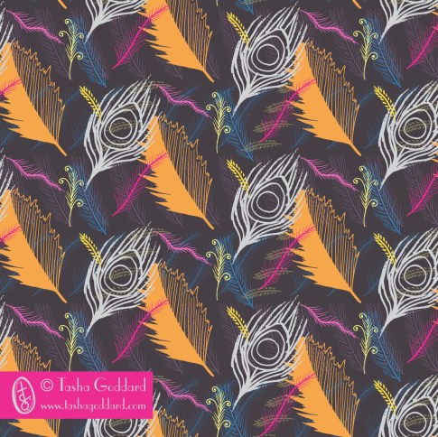


The great thing here, is that I have lots of little icons that I can do stuff with at a later date, if I want to. I didn’t really do any digital icons this time, but I’d quite like to next week, if I can fit it in. I’d love to find a good vector app for my Surface (yes, I can use Illustrator on there, but I’m thinking a more basic app, maybe, for easy playing), so I can do a bit of digital icon creation on the train or sitting on the sofa or in the park… Then again, I do love sketching, so don’t want to let go of that.
Next week: Fruit
Next week, I want to go with a week-long theme, so that each day’s minis can be tied together a bit more and so that I can also have a word (or maybe even words!) at the end, to use in the designs. So, I’m going to go with FRUIT. It conveniently has five letters in it, one for each day (the weekend is for pulling together the minis) and I will do them in order. I want a warm and bright colour palette, so I’m going to go with yellow, orange and red fruit. I will pick one from this list each day:
- lemons
- oranges
- apples (red)
- strawberries
- raspberries
- bananas
- peaches
- pomegranates
- grapefruit
- pears (yellow)
- apricots
- persimmons
- guava
- cherries
- grapes (red)
Of course, next week is the start of a new MATS Bootcamp month, so I will also have a big mini to concentrate on for that. Going to make sure I do at least one page of mine for each day. (How convenient would it be if Lilla picked fruit for this month, though?)
If you’re joining in and have blogged about it (or instagrammed), leave a link here. I might even do a round-up post, if there’s enough of you! Thanks to Chiara and Sareka for joining in on Instagram! Do tag me on Instagram if you join in, so I can give you a shout out (and see what lovely stuff you’ve been drawing).

A Mini a Day; A Letter a Day; A Colour Palette a Week
I’ve decided to do a mini (*) and a letter a day for a while (I’m not going to set a specific time limit – I might do it for a couple of weeks, or I might do it for a whole year).
So, every day, in the morning, I’m going to pick a subject and a letter and whenever I doodle/sit down for 10 minutes with my sketchpad, etc. on that day, I will draw that subject and do a variety of hand-drawn versions of that letter.
Then, on the weekend, I’ll pick my favourites from the week and make some patterns and placement prints from them, using “A Colour Palette a Week”, which I’ll pick on Friday night/Saturday morning. I’m hoping that this will lead to a few natural/spontaneous collections, or at least a bunch of cool designs.
So, today is brought to you by the subject “Umbrellas” and by the letter “B”. I’ll try to share them on Instagram/Twitter with the hashtags #aminiaday and #aletteraday and will do a blog post with final weekly designs. I’ll probably also share it on my Facebook page.

I’ve scribbled down a list of potential subjects in case I get stuck, but I won’t necessarily pick from this list – something might jump out at me.
Potential minis
- skateboards
- flamingos
- meerkats
- strawberries
- vintage telephones
- doughnuts
- penguins
- teapots
- lighthouses
- monkeys
- lions
- diggers
- lollipops
- picnic baskets
- cactuses (cacti?)
- hedgehogs
- feathers
- cocktails
- umbrellas
- saxophones
Feel free to join in, if you want to. If you do join in and blog about it, let me know, and I’ll share your posts, too.
(*)Those of you have done MATS A, B or Bootcamp will know that this is essentially taking one thing/theme and drawing the heck out of it – in Bootcamp we’ve done cuckoo clocks, jellies and dolls/faces, some that people have done in the various MATS iterations include vintage pyrex, succulents, snails.