

Going with the flow – floral pattern
Part of the new calmer lifestyle I’m trying to adopt, I’m throwing out all my design career goals and schedules and plans and ‘going with the flow’. That doesn’t mean I’m not going to do any work for studios – but I will only do so when I have the time and when it’s a call/assignment/trend that really calls out to me. There are opportunities at all of the studios I work with for this, but I have a tendency to try to challenge myself to new things (not always a bad thing, of course) or to do a gazillion designs for one assignment, rather than one considered one.
Mostly, though, I want it to mean getting back to enjoying creating art that I love – both creating and looking at. Enjoying the process and just really embedding myself in whatever I’m creating (this is a mindful thing in itself, I believe, from what I’ve read).
Friday night, I did some loose pen and ink doodling – flowers (so often flowers!) and Saturday night I dived into Illustrator and dug into my most preferred method – and then mixed it up a bit. I had such a lovely time (I did watch something at the same time – that’s a habit I may struggle to break – The Hundred Foot Journey, which was a lovely film to watch) doing and was really pleased with the result.

My favourite is the grey blue background. I like the faded silhouette leaves in the background, but I wonder if they might be better done to fit in much more in the gaps of the main design, rather than just as a repeat behind them.
Anyway, the point is that this is what I love to do. Create patterns from the heart – whether based on drawings, paintings or completely digital. Explore colour combinations and test out what different background colours do to a design (I love how different purely changing the background colour can make the feel of a design). Play about with fitting motifs together in a pleasing way.
I really like the effect of having the black and white collection of flowers, juxtaposed with the colourful print/cutout effect ones. This is a bit of a new thing for me.
The whole process of this was free of stress or anxiety. It was just for me, without the need to meet a brief, meet a deadline, or try to work in new methods. Proper relaxation. I hope I get to do more and more of it.

Holiday Flowers: New Colouring Book and FREE sampler
While on our holidays this year (in a very beautiful Cornish pair of villages – Kingsand and Cawsand), I did quite a bit of drawing full pages of stylised flowers – this seems to be my go-to relaxation technique – and I shared most of them on Instagram or Facebook. A few people said they’d love to colour them, so I decided to make a new colouring book largely comprising the flowers I’d drawn on holiday. You can buy it from my Esty store and here is a free sampler to download, too. I’ve done this sampler a bit differently – instead of a single design to colour in, I’ve done a page with snippets from each of the designs. Please do feed back to me on which you prefer, and of course, feel free to share your coloured designs with me.


Another colouring book – and a free sample
Well, it’s taken a while, sorry, but I’ve uploaded my second printable colouring book to Etsy.
And I am, of course, offering you a free sample as a little taster – hopefully it will whet your appetite enough to buy the whole book, but even if it doesn’t, I hope you have lots of fun colouring it in! Feel free to share your colouring efforts on My Facebook Page or My Instagram Page so we can all see!
This books all about the flowers and they’re all in a kind of Art Nouveau symmetrical style (one of my favourite designs/patterns to make). I’m hoping to create a new book every few weeks if I can, and will post them here, along with a taster, whenever I have a new one ready.


Have fun!

On gratitude and the blues

This weekend, Chris and I both had to do a lot of work. This meant we didn’t have time to take the girls out to cinemas or swimming or to hang out in cafes and museums. They got their homework done, had their baths, got given breakfast, lunch and dinner and also had approximately 5 billion little curious questions answered. And then they read and tidied and watched a bit (not much more than normal, though) and played with each other and on their own. Mostly they didn’t try to tear each other’s heads off, and they definitely managed to restrain themselves from wrecking the house. Mostly they were happy and occupied and entertained.
And yet… I’ve been feeling grumpy and guilty and sad that we haven’t at least one of us been spending big chunks of fun time with them. I’ve felt resentful at the work (which is not anyone asking the impossible, but rather things suddenly colliding in the unplanned way that happens now and then – or a lot, really – in the publishing world). I’ve been frustrated that I haven’t been able to have my normal few hours of dedicated design time that I get at weekends. I have trained myself now to use design time and drawing and painting as my way of winding down from work and from parenting and any other responsibilities that happen to be throwing themselves at me in any particular week or on any particular day. So when anything cuts into that time, it hits harder than it might otherwise do.
So, I was feeling grumpier and grumpier throughout today and started to feel resentful about seeming to be the only person responding to the girls’ requests and demands (not true, but my grumpiness made it seem so). The crunch came when an earlier promise to have dinner made for me looked like it was to fall through. I stomped off to the shop to get the bits and pieces we needed – milk, bananas, creme fraiche. My mood lifted a little as I walked through the park, catching glimpses of snowdrops and crocuses, speckled with raindrops from the earlier shower, seeing patterns in the clouds and bare trees starting to show little green buds… At the shop, it occurred to me that the children had been remarkably good and well-behaved and kind, so I added pudding to the basket and then threw in a last-minute pair of Zomblings and packet of mini eggs (yes, that did entirely make up for no fun trips out – I know them well). And I may have added a bottle of wine for the grown-ups, too.
The walk home helped clear my mind a bit more, though the blues had not entirely lifted. I thought a lot about how our life before children was filled with work – we worked most weekends and most evenings (much less efficiently, somehow) and looked forward to bank holiday weekends because they meant we could get even more work done than usual with no phone calls or emails interrupting us. When I got home (after distributing my bounty) I cleaned the kitchen and remembered how much I actually enjoy doing that, when I have some peace and quiet and time to myself to think.
And then I thought about how ridiculous I was being and what a spoilt little brat, frankly. One weekend of working instead of spending fun time with the girls? One weekend of not getting 15 hours of designing in (and I did still manage to find an hour and a half to do some painting last night, and did a bit of sketching on my scrap paper)? One weekend where I had to stop work to make a few wraps or cups of juice? One weekend where I had to step away from the computer to brush conditioner-laden hair and pull a nit comb through it (all clear, still, hoorah!)? One weekend where we didn’t manage to hoover and clean the bathroom (OK, there are probably a few weekends where we don’t manage them!)?
One weekend not working out brilliantly, when so many people are working their weekend after also working their whole week. When so many people are having to go into work, while their kids go to grandparents or friends, because their zero-hour contract means they have to come in whenever they are told. When so many people are struggling to feed and clothe their children and certainly don’t get to make up for it by throwing Zomblings and sweets at them, or by sticking a £4.99 bottle of red in their shopping basket. When so many families are stuck in bedsits or even out in the cold, because they couldn’t afford the bedroom tax. Yeah, one weekend – or even a few – of having to fit in work, is really nothing to complain about.
I’m grateful for my two careers, for our established business and my burgeoning one, for our two healthy and bright and energetic and (mostly) happy daughters and our cuddly, and slightly deaf, dog, and the roof that doesn’t leak and belongs (mostly) to us and has many rooms under it, that are warm and dry and full of stuff and love, for our families close by and far away, for our excellent school staffed by wonderful teachers and support staff, only five minutes (or half an hour, depending on how many stones you’re picking up or walls you’re climbing) away, for our full fridge and working cooker and our internet access and many computers, phones and tablets, for the hundreds and thousands of books filling our house and the hundreds and thousands more just down the street and available for the grand total of absolutely nothing, for the doctor down the road and the chemist who give me statins and asthma medication for a teeny amount of money and the midwives and nurses who looked after me and the girls in their early hours, for the neurologist and the MRI machine and the nurses and their needles who will work out what is wrong with me, for the grand total of absolutely nothing, for the park only five minutes away and the other parks and fields and commons and woods so close by, for the town full of charity shops and cafes (and strangely lacking in men’s clothing stores) and brimming with artists and authors and poets and musicians and old friends and new ones. And for a tonne of other stuff, too.
So this week, the only blues I’m going to let in are the indigo paintings and patterns I’ll hopefully fit in if the other work calms down a bit. And even if I don’t have time for them? I’ll be fine 🙂


When it all just flows

I don’t really have a problem with artist’s block (touch wood) but sometimes it takes a while to get into a brief, especially if you’re trying to do something that’s a little outside your comfort zone, or something that’s not really ‘you’. A lot of freelance and agency work involves pushing out designs quite quickly and in quite large quantities, which can sometimes wear you out a bit. I still love doing those, and hope I always will, but it’s so lovely to have an evening to just go in my own direction completely.
I’ve had a few evenings of being too tired to sit and draw or design (evenings and weekends are my main design times) and had very early nights. Last night I was very excited to have the energy to sit up at my desk and do some designing. There were a few ‘money designs’ I could have worked on (for print studios and some aimed at specific mailouts, for example) but, after a few off days, I needed the time to just go with the flow. And the flow took me to poppies and ogees (yes, ogees are definitely my thing at the moment – I just can’t resist them!).
Chris spotted this awesome book in a local charity shop the other day and I had a flick through for some pictures to inspire me and landed on the poppies.


I did a bit of sketching to work out what I wanted to do and I also gathered together some bright and juicy poppy colours – used a couple of poppy photos as a reference.

And then I loaded up Netflix so I could watch the first couple of episodes of the new ‘Better Call Saul’ series (loved it!), and got down to playing.

I may have also had a couple of glasses of Prosecco to lubricate the creative flow!
I had such a lot of fun and stayed up until almost midnight, but felt fine for it. Some late nights are more wearing than others, but if I’m painting or designing to please just me, then those are the best and the most relaxing.
Have you found some time to just create what you want to create recently? What are your best times of day for creating?

The Landlady – Patternmash project
I joined up for Hannah’s Patternmash project at the start of January. Hannah provides monthly briefs to create patterns/collections for. Not hugely unusual, I suppose, but… her briefs are really well-thought out and researched and in-depth and she provides supportive moodboards, colour palettes and more. I think it’s the depth and the reaching beyond the comfort zone that has appealed to me. I love Bootcamp (must write a post about the Bootcamp January project, too) and MATS and the assignments that come from there, but the Patternmash ones have a subtle difference and make me think on a deeper more artistic level that I wasn’t actually sure I could (I am so very much all about the ‘making pretty patterns’ and usually really dislike having describe anything on a deeper level than ‘I saw pretty flowers. I drew pretty flowers. I made them into a bright and fun pattern.’)
Anyway, I’m all gushy about it after January. Who knows if I’ll be equally gushy at the end of February, though I’m already excited about another ‘outside my comfort zone’ brief, so hopefully.
January’s brief was to create a pattern (or collection – I think the idea is usually to create a whole collection if you can) inspired by Roald Dahl’s short story ‘The Landlady’, a macabre short story about a landlady of a B&B that has remarkably few guests, and a penchant for stuffed animals. Hannah provided the story, a moodboard and a colour palette and I have to admit being initially completely thrown. How do you make a pattern from a story? Surely you make an illustration? But I drew some teacups and I drew some carnations (the landlady liked her tea rituals and there was an evocative description of yellow carnations). And then forgot about it for a while, as my design time was being eaten up by money work and then I went off on some other tangents and then I did the Bootcamp assignment and then I realised the the deadline was only a couple of days away, had nothing else I absolutely had to do during my design time, so thought I needed to give it a go.
I’m sooooo glad I did.
I had definitive ideas for patterns as soon as I sat and looked at my sketches and I made them over two nights. My favourite is absolutely the damask, though I’m pleased with the teacups, too.
Landlady Damask
This pattern takes the carnations from the story, placing them in a traditional wallpaper repeat (a bit of a shout out to William Morris) and then adds in a little macabre twist.

Nightshade Teacups
This one is a little more subtle and picks up the teacups from the story, and intertwines them with tangled stems of deadly nightshade (the decorations on the teacups are also deadly nightshade).

Hannah shared my damask pattern on Twitter and someone (Sam Meech, @videosmithery) said they’d like to see a book cover treatment with it, so I had a go – and ended up making three (Paperback A format). Now, there’s an application for pattern design I hadn’t been thinking about much – any of my publishing friends and colleagues fancy some funky patterned covers for your textbooks?


If you like the sound of the briefs, check out Patternmash. There’s a free version you can sign up to if you’re not sure, but I highly recommend the full paid version and look forward to showing you next month’s.

Drawing, drawing, drawing
Much of my December designing was all done in Illustrator – though almost always starting with sketched ideas and plans.


I then squeezed in some painting at the end of the month, using some new paints – Golden Acyrlics – oh wow, I am totally and utterly in love with these paints. The only acrylics I’d used before were fairly cheap ones and I hadn’t really taken to them. Of course, I end up taking to the really expensive materials. But they are expensive for a reason! I only bought four colours, plus white and black, which was actually oddly freeing.


Anyway, this post is supposed to be about drawing, not painting! Maybe I’ll write a painting post one day. 🙂
This month, I’m diving into what I intend to be a super-productive and extra successful year. Included in that are MATS Bootcamp (this is a much more relaxed pace than the full MATS courses, but still great fun and you get to meet loads of other creatives around the world and see their awesome and inspiring work and learn new tips and tricks from them – just love it) which started on Monday, signing up for Patternmash, for which a new brief came out at the weekend, doing a weekly flower-drawing challenge (thanks Lidija for this) and also working to produce a regular supply of patterns for Patternbank and other pattern agencies.
So, I’m doing lots of drawing at the start of the week, which will then feed into Illustrator (and maybe even Photoshop, you never know!) later in the week. For Bootcamp and Patternmash, the assignments are not due for a while, so there may be less drawing next week and more digital work. But I’ll frankly never stop drawing on a daily basis – even if it’s just doodles and sketches around my work notes!


As I was looking through my pictures for some of the digital images from December, I noticed that quite a lot of drawings, too. So, yes… even when it feels like I’ve been concentrating on Illustrator work, I’ll still be drawing loads!


Goals, tasks and accountability – NOT resolutions
Continuing on the ‘I don’t do New Year’s Resolutions’ theme, I am still looking to start the new year with a fresh attitude and raring to go. Because the girls start back to school on Monday (5 January), and that’s also when I’ll be officially back at my (TAG Publishing Services) desk, I’m really treating 5 January as my start of the year. I’m getting myself prepared in lots of different ways over this weekend, so that sitting down on Monday morning will feel like a fresh start and I’ll be raring to go.
Design business goals
Shortly before the Christmas break, I set up an accountability group with five other designers. We are each at different points in our design careers and so have a variety of goals for the year and/or the next few months. We’re sharing our goals with each other and then will be sharing on a weekly basis our achievements of the last week and our plans for the next week. It’s a positive group where we can hold ourselves accountable in a supportive manner with people on similar journeys. We’ve only just started so I can’t tell you how good it is, but my feeling is that it will be very useful and give us that extra push to keep to our goals and assess our plans as we move along. If you’ve set some business or personal goals for the year or for the next few months, why not start your own accountability group, or find an accountability partner to work with talk over your plans?
I made myself some pretty goal and to do lists and printed out my medium-term goals, as well. Because we all know that beautifully designed task lists are much more successful than standard scribbled ones. (Don’t we? Someone must have done some research on it, surely?)

I’m also signed up for MATS Bootcamp and MATS B from Lilla Rogers. I’m considering adding in Mastering your Market (probably the middle option) from Pattern Observer, too, but might leave it until the next run.
TAG goals
The design business is only half of my business world. Chris and I also run a successful business providing services to the educational publishing industry. These days I predominantly do project management and design work, but also take on editing, proofreading, and CD development, for example. Chris does a wide variety, but is a particular whizz at making Captivate tutorials and extremely funky PowerPoints and has been putting together a lot of CD-ROMs this year. He’s looking to take on some more project management this year. We will be sitting down on Monday to have a start-of-year chat about where the business needs to go – and where we each want to fit in within it. Sometimes we have to do things we don’t like, but it’s good to talk these things through so we can aim to do more of what we enjoy, rather than just leaving things to potter along as they have been (even if the talk ends with the status quo continuing!). In preparation for Monday, I’ll be doing my Inbox filing which had got a bit out of hand since I last did it in September (I am totally going to do it daily from now on) and I bought my diary (I’ve found that using a physical diary as well as Outlook’s calendar and tasks, really helpful this year – I mostly used it for work, but do tend to also add important household and school appointments and tasks in there, too).

Parenting goals
Now both the girls are at school, their goals tend to focus around school and after-school during term-time. There is some clothes and toy sorting that I’d really like to get done before Monday. After two weeks of a bit too much screen time (though we did set down rules at the start of the holiday to ensure it didn’t get too silly!) we will be moving back into term-time mode where there is no screen time in the morning and we where mornings concentrate on reading, spellings, times tables, violin practice and so on – playing, drawing, building, baking, etc. in any left-over time. (Weekends they get computer time in the morning.) They will be continuing with swimming classes and need to decide today whether they want to continue with gymnastics or change to something else (or cut an activity). The return to routines is almost always a good thing for us, as it helps them to know what’s happening and what’s expected of them. I’m keen to introduce some kind of more official chore sharing and have a few ideas I’m going to put forward for this. I’m also going to continue with my efforts to be more positive and supportive and to shout less. I think last year’s word (serenity) really helped me with this, but I’m still not quite the calm and supportive parent I want to be. I’d also like to make a ‘Remember this’ list for each of them, to help them remember to bring home their water bottles and homework diaries and so on. We also have a calendar (thanks to Abel & Cole) and I’m going to write down all the important school (and other) dates on there, so that we can all check and know who’s supposed to be where and bring what!
Household goals
We still have some big things that we want to do – buy a new cooker (more complicated than it sounds due to needing to disconnect and reconnect the gas) and get a new bathroom bought and fitted (including someone else doing the tiling!). And then there’s some general decluttering type stuff that needs doing and I also have a wish list for some storage solutions that I’ll be looking out for deals on. I have some ideas for the general decluttering/sorting, involving 15-minute tasks. I haven’t really formulated my ideas properly but may blog about it when I have. For the most part, apart from the biggies, household stuff will involve keeping on top of the general stuff and maybe coming up with some miraculous laundry schedule that there are never any piles of laundry waiting to be put away. I hope the chore sharing ideas we’ll be talking about will help with this.
Health goals
I would like to make a few little dietary adjustments – get back to eating yoghurt and fruit in the morning, rather than toast and always have at least one salad on the go (depending on the salad – some will last a few days, but most only about 24 hours). Other than that, my diet is pretty healthy. I’d like to make sure I do exercise that I can. At the moment, pilates and yoga seem to be good choices – swimming, walking and most gym stuff makes my dizziness and numbness much, much worse. I’d also quite like to try a 10-15 minute dancing session every day, adjusting to what my body can copy with at the time, because I love dancing and a short burst should hopefully not be enough to make the dizziness worse. Other than that, I’ll be hoping that the further tests and referrals will identify my health problem and then fix it. In the meantime, though, I’ll follow my body – if I get another period of feeling good, I’ll make the most of it and up the exercise levels a bit; if I have a really bad period, I’ll rest more and sleep for longer periods, and so on.
So, you see… none of those were resolutions – they’re all just general goals and preparation for the New Year. Happy New Year to you, too, and I wish you success, luck, happiness – and that your journey in 2015 is a pleasant and fulfilling one.

Summer School with Make it in Design
The Make it in Design team very kindly provided a fantastic pattern design summer school over the last few weeks. We had three sets of assignments, about two weeks apart and there was a Beginner Track, Intermediate Track and Advanced Track and there was a different brief, but within the same megatrend. I had only signed up for the Advanced Track, having taken Modules 1 through 3 of The Art and Business of Surface Pattern Design, but once I was in the Facebook group (which had over a 1000 members!), I saw people discussing the other briefs and thought I wanted to have a go at them all. Luckily, although registration for the summer school was closed by then, people signed up for one track were able to register for the others, so I got all three briefs.
Assignment 1 – Impulse
Assignment 1 followed the Impulse megatrend, with lots of trend guidance courtesy of Stylesight and additional information and suggestions from Rachael Taylor and the Make it in Design team. Due to dashing off on holiday (to somewhere without wi-fi!) shortly after the assignment came out, I was actually only able to submit to the Beginner Track, but I completed the other tracks when I came home, because I wanted to.
Sketches
I started off drawing lots of sketches and also a bit of mark-making for texture.


Textures
I also tried out some textures using ink and water splodges.


Moodboard
I created a moodboard for the Advanced Track, but didn’t manage to for the others, since I was away. I won’t post it here, as I used photos from Pinterest, as it was just for my personal moodboard. If I were creating a moodboard to share publicly, or for a client, I would use copyright-free imagery, stock imagery and my own images.
Beginner Track – Tropical Paradise
These patterns were created from some of the scanned pictures above. I image traced them, and then created a number of different versions – silhouettes, lines only and ‘cut outs’ (i.e. lines missing) and then laid them out together to fill a repeating tile (a square). I tried some half-drop layouts, but felt that a straight repeat worked particularly well here. I do really like the dark background, as the motifs jump out a lot, but I think the light grey background works better for the tropical feel. This track was definitely my favourite one – maybe because I got to make a conversational print, which is one of my favourites (after florals). (This is all done in Illustrator.)


You can see the other Assignment 1 Beginner Track entries in the gallery.
Intermediate Track – Retro Geometric
I started off with some plain arches within squares, which is quite a pleasing shape (I think, anyway!), but it looked a bit too plain, so I added in some textures using some of the mark-making I had done. (This is all done in Illustrator.)


You can see the other Assignment 1 Intermediate Track entries in the gallery.
Advanced Track – Water Rays
I wanted to include some texture in here, so used some of the ink splodges and recoloured them with the colour palette provided. I used this as a background layer and then overlaid a variety of my wave drawings – again some, as cut outs, some as lines only and some as lines with fills. I varied the scale of the wave drawings and used a standard repeat for some layers, and a half-drop for the larger, top wave. [This was mostly done in Illustrator, though the ink splodges were recoloured in Photoshop.]


You can see the other Assignment 1 Advanced Track entries in the gallery.
Assignment 2 – Confluence
Assignment 2 followed the megatrend Confluence and combined tribal with animal print, neither of which usually appeal to me much (especially the animal print – really, really dislike animal print on clothes, maybe because it makes me think too much about the use of animal skin and fur in clothing!).
Sketches
Again, I started off with some sketches (actually, this time, I also had a pencil sketch page in my sketchbook, with notes – you can’t see it very well from the photo, sorry!), drawing women carrying pots on their heads (something that always amazes me!), trees (I looked up a bunch of African trees), and vases, as well as some decorative motifs and some animal print textures.


Beginner Track – Tribal Shapes
This one was my favourite – again, probably because of getting to do a conversational print. Also, I took a lot of inspiration from my mum’s living room, which she has themed to Africa and which is full of African art, from wooden statues, to masks, to beautifully painted trays and tapestries and paintings. I also love these bright colours – they really sing out to me. I made a tonne of different patterns for this one. I submitted the first one.


You can see the other Assignment 2 Beginner Track entries in the gallery.
Intermediate Track – Animal Print
Here are the animal print patterns I made, none of which really sing out to me, I’m afraid. I submitted the first one, which is a layered combination of three of the patterns, using opacity to provide texture.


You can see the other Assignment 2 Intermediate Track entries in the gallery.
Advanced Track – Tribal Collage
And finally, for the tribal collage brief, I used patterns from the beginner track and combined them in a collage using animal print shapes from the intermediate track. I submitted the first one.


You can see the other Assignment 2 Advanced Track entries in the gallery.
Assignment 3 – Dissonance
Assignment 3 followed the megatrend Dissonance. My favourite was the Advanced Track, which I was immediately drawn to and knew exactly what I wanted to do. I also liked the Intermediate feathers theme, but the Beginner Track really didn’t draw me in at all. I’m not big on jewels (in the sense of gems and diamonds, at least – I love jewellery made from glass and colourful beads and some nice stones, though usually not precious ones). I still completed the Beginner Track, though, but at the very last minute and not with as much thought and effort as the rest. Oh yes, and this time, I actually made mock-ups for the Intermediate and Advanced patterns. Which was actually kind of fun, so I may do it a bit more often. (Though these were wallpaper mock-ups, which are much easier to do than boxes, or mugs and things like that!)
Note: The gallery links for Assignment 3 will go live at some point on Friday 5 September – they are not live at the time of posting.
Sketches
I did some sketches, and a few feather pictures with my watercolour brush pens (though didn’t end up using the latter). I also did some sketches and took notes for the Advanced track tiles, though they were created entirely in Illustrator.


Beginner Track – Jewels
As I said, this was done fairly quickly. I used geometric shapes and opacity to give the feeling of gemstones and then created a somewhat scattered repeat, with a manual flipped half-drop. I quite like this as a simple pattern (perhaps to be a co-ordinate within a collection), though I’m not entirely sure it fully depicts the jewel theme.

You can see the other Assignment 3 Beginner Track entries in the gallery.
Intermediate Track – Feathers
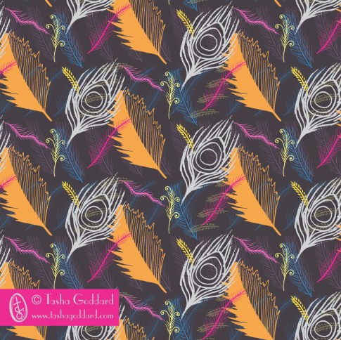
This was fun. It uses my fairly common method of drawing with pen (Pentel Brush Pen and Sakura Pigma Microns), scanning, image tracing, and then The hardest bit was deciding on the colour palette to use! The top one (with mock-up) is what I submitted, and then there are a bunch of other colourways, that didn’t make the pick.


You can see the other Assignment 3 Intermediate Track entries in the gallery.
Advanced Track – Intricate Chaos
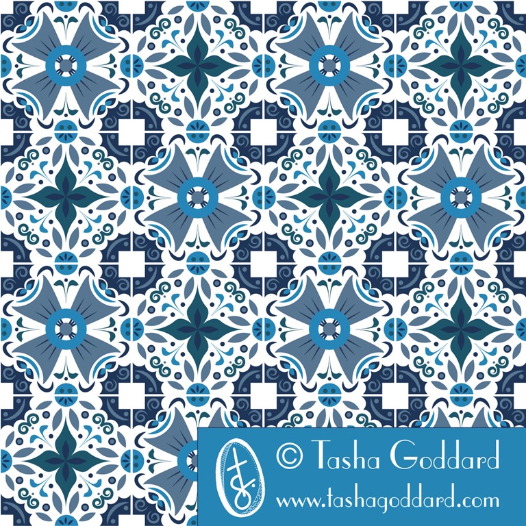
And finally, my favourite – probably of the whole of summer school – intricate chaos. In the brief, there was some imagery (and in the Stylesight trend reports for Dissonance, too) of intricate tile designs and that immediately sprang out to me as what I wanted to do for this. I love, love, love blue and white tiles and thought I would do that throughout (and ended up submitting it), but there were also some very colourful tiles featured in the brief, so i thought I’d also give it a go with a colourful version. I created the designs entirely in Illustrator, first of all creating a grid with vertical, horizontal and diagonal lines, so that I could snap the elements to them. i then created a background that I wanted to repeat on all tiles, that would allow them to fit together, while being actually different designs – so there’s a circle and square that fits together at the corners and circles that fit together on each of the sides – if you look at the mock-up, you can see more clearly how it works.
I created four tile designs, loosely based on my initial sketches. I used a lot of ellipses, and also did a new trick of drawing a line (or a spiral), changing the stroke to a brush or calligraphic style, and making it a big stroke weight, then outlining the stroke, to make it into a shape, rather than a stroke. I made a lot of use of the Transform > Rotate tool as well, to get repeated rotated symmetrical elements. And then I made the tiles into symbols and repeated them to create a four-by-four tile. Once repeated, I made a number of tweaks until I was happy with how they fitted together.
This is what I submitted, but I went through a number of versions before getting there, and got some really helpful feedback in the Facebook group (seriously, the Facebook groups in all these classes are absolutely amazing – everyone’s at varying stages of their careers, with various experience and education behind them; some people are or have been art directors; some work for top design companies or big brands, and everyone is incredibly generous with sharing their methods or suggestions and tips with technology), including added something into the white squares, which I think made a massive difference.


And here’s some bits from the process.




You can see the other Assignment 3 Advanced Track entries in the gallery.
If you’re interested in surface pattern design, do take a look at the courses offered by MIID. I have done Modules 1, 2 and 3 and am hoping to do Module 4 some time next year (depending on the timing of the courses offered). I would say they have been worth every penny and are an excellent investment in your career, if you are looking to make surface pattern design your career, of course!

A Mini a Day: Week 1
So, this was the first week of doing my ‘A mini a day, a letter a day’ and it wasn’t a full week. I definitely enjoyed having a bit of a focus to my doodling and I think, though I still did my normal random (mostly floral!) doodles. I found myself being more drawn to the minis, rather than the letters, but I don’t want to drop the letters, because I do think I could use some improvement (or sophistication, perhaps!) in my hand-lettering. I didn’t really use the letters in any final designs/patterns, though. Maybe I need to wait until I’ve gathered together more of an alphabet.
Here are some of the doodles/sketches (on the first day, I had time to do a bit more, and was able to do some colour sketches, which I then used for the week’s colour palette):
Wednesday: Brollies and the Letter B


Thursday: Saxophones and the Letter X


Friday: Feathers and the Letter T


And the final designs I made last night.




The great thing here, is that I have lots of little icons that I can do stuff with at a later date, if I want to. I didn’t really do any digital icons this time, but I’d quite like to next week, if I can fit it in. I’d love to find a good vector app for my Surface (yes, I can use Illustrator on there, but I’m thinking a more basic app, maybe, for easy playing), so I can do a bit of digital icon creation on the train or sitting on the sofa or in the park… Then again, I do love sketching, so don’t want to let go of that.
Next week: Fruit
Next week, I want to go with a week-long theme, so that each day’s minis can be tied together a bit more and so that I can also have a word (or maybe even words!) at the end, to use in the designs. So, I’m going to go with FRUIT. It conveniently has five letters in it, one for each day (the weekend is for pulling together the minis) and I will do them in order. I want a warm and bright colour palette, so I’m going to go with yellow, orange and red fruit. I will pick one from this list each day:
- lemons
- oranges
- apples (red)
- strawberries
- raspberries
- bananas
- peaches
- pomegranates
- grapefruit
- pears (yellow)
- apricots
- persimmons
- guava
- cherries
- grapes (red)
Of course, next week is the start of a new MATS Bootcamp month, so I will also have a big mini to concentrate on for that. Going to make sure I do at least one page of mine for each day. (How convenient would it be if Lilla picked fruit for this month, though?)
If you’re joining in and have blogged about it (or instagrammed), leave a link here. I might even do a round-up post, if there’s enough of you! Thanks to Chiara and Sareka for joining in on Instagram! Do tag me on Instagram if you join in, so I can give you a shout out (and see what lovely stuff you’ve been drawing).

A Mini a Day; A Letter a Day; A Colour Palette a Week
I’ve decided to do a mini (*) and a letter a day for a while (I’m not going to set a specific time limit – I might do it for a couple of weeks, or I might do it for a whole year).
So, every day, in the morning, I’m going to pick a subject and a letter and whenever I doodle/sit down for 10 minutes with my sketchpad, etc. on that day, I will draw that subject and do a variety of hand-drawn versions of that letter.
Then, on the weekend, I’ll pick my favourites from the week and make some patterns and placement prints from them, using “A Colour Palette a Week”, which I’ll pick on Friday night/Saturday morning. I’m hoping that this will lead to a few natural/spontaneous collections, or at least a bunch of cool designs.
So, today is brought to you by the subject “Umbrellas” and by the letter “B”. I’ll try to share them on Instagram/Twitter with the hashtags #aminiaday and #aletteraday and will do a blog post with final weekly designs. I’ll probably also share it on my Facebook page.

I’ve scribbled down a list of potential subjects in case I get stuck, but I won’t necessarily pick from this list – something might jump out at me.
Potential minis
- skateboards
- flamingos
- meerkats
- strawberries
- vintage telephones
- doughnuts
- penguins
- teapots
- lighthouses
- monkeys
- lions
- diggers
- lollipops
- picnic baskets
- cactuses (cacti?)
- hedgehogs
- feathers
- cocktails
- umbrellas
- saxophones
Feel free to join in, if you want to. If you do join in and blog about it, let me know, and I’ll share your posts, too.
(*)Those of you have done MATS A, B or Bootcamp will know that this is essentially taking one thing/theme and drawing the heck out of it – in Bootcamp we’ve done cuckoo clocks, jellies and dolls/faces, some that people have done in the various MATS iterations include vintage pyrex, succulents, snails.

MATS Bootcamp – Jelly!
March has been all about jelly. I found the topic a little less inspiring than last month’s cuckoo clocks, but still ended up having fun with it (despite a crazy ‘other work’ month that saw me with very little design time on my hands). Fortunately, drawing, painting and making pretty patterns are all part of how I relax, so every spare moment I will have my head in a sketchbook, looking at Pinterest for colour inspiration or having a play in Illustrator. I even fill my notebooks and work diary with doodles drawn while waiting for files to upload or computer processes to complete.
The start of the process was the mini – jelly moulds!
I did some sketches:
 And then I played with putting them into Illustrator and colouring them.


I wasn’t hugely excited by what I’d come up with, though.
Then the assignment came and it was bolt fabric. Which meant patterns… Hooray! Patterns are totally my thing. I love, love, love making patterns. But I didn’t have time to really get into it and was thinking about different ideas and not using my motifs from the mini. Then Lilla’s surprise – which was about colour again – came and there was a nougat palette which I felt inspired to play with:


This was definitely feeling a lot better and I was happy with the motifs and the layering and the repeat, but the colour wasn’t quite singing to me. So, then I had a play with neutrals, which was the other part of Lilla’s Week 3 surprise. From what I’ve read about MATS A and MATS B courses, Lilla is very big on having neutrals in a design.
I played with some (new acrylic) paints:

And then I played in Photoshop (strips of colour, overlaid with strips of translucent (at different opacities) white and black. And then I picked out the colours that really sang to me from this playing. And came up with this colour palette:

It feels like Spring and Juice and Bouncy Jelly. I love it!
In fact, it occurred to me that the colours were really similar to some flowers I bought the other day:

This is what I submitted:

And here are some other colourways:


(Look at the collection on the main page to see the co-ordinates in their full glory.)
We’re taking a break for April, as they’re running MATS A and B. This is probably a good thing for me, too, as ABSPD Module 3 starts on Monday, so I’ll be pretty busy with that!
Please contact me if you’re interested in licensing any of the designs on this site, or commissioning new ones.

MATS Bootcamp – Cuckoo Clocks
 I am so very glad that I signed up for the Make Art That Sells Bootcamp, from the awesome and inspirational Lilla Rogers. It’s a long-term (runs over a number of months) portfolio-building session – not quite a course, but there are lots of course-like aspects. You get a mini the first week of a month, then an assignment, then a little something special (could be some tips, an interview, some other tidbit) and then you get to share your completed assignment on the class gallery, which is public and promoted widely.
As with the ABSPD modules I’ve taken, one of the best aspects is being part of a group of creative people (in this case, a Facebook group). There is a really wide range of experience in the group, with a fair number of established and successful designers as well as quite a few beginners – and the full gamut in between. People share what they’re doing for the minis and assignments (you don’t have to, but it’s really useful to do so) in the Facebook group and get feedback. Because there are so many very experienced designers in the group, the feedback is often really useful (e.g. suggesting a tweak to a design, a different direction to explore, a colour change, etc. etc.), but always very supportive. The last few days we’ve all been sharing our finished assignments (or close to finished) as the deadline for submission to the gallery is tomorrow. The gallery should go live next week and it will be really exciting to see all the designs collected together. What we’ve seen on Facebook has been truly awesome!
I went round and round in circles doing my assignment (cuckoo clock inspired design for phone covers), but had great fun doing it.
This is what I submitted in the end:

And here’s how I got there:
Sketches…


Colour and pattern…


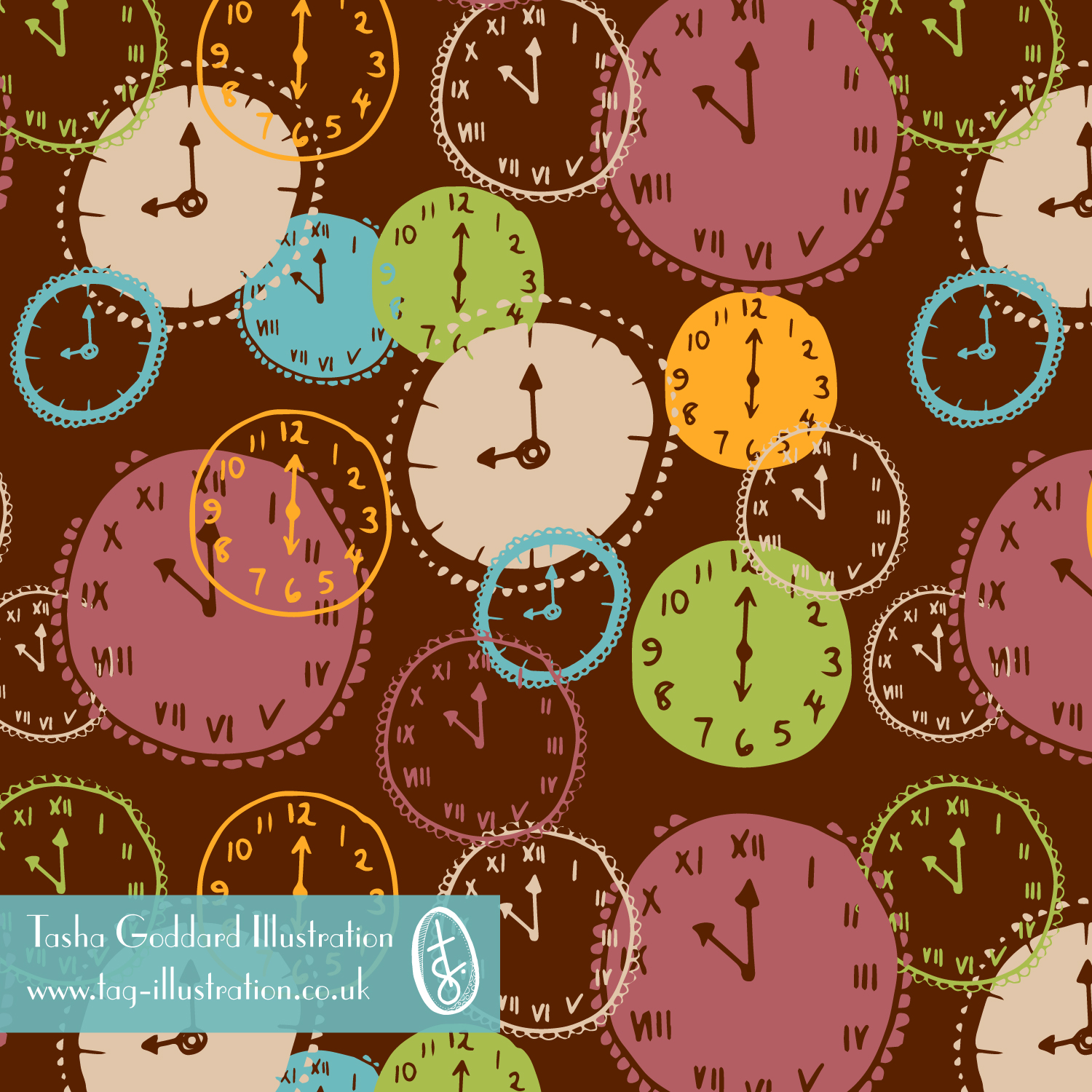

Different colours:


Cuckoo clocks and mock ups…
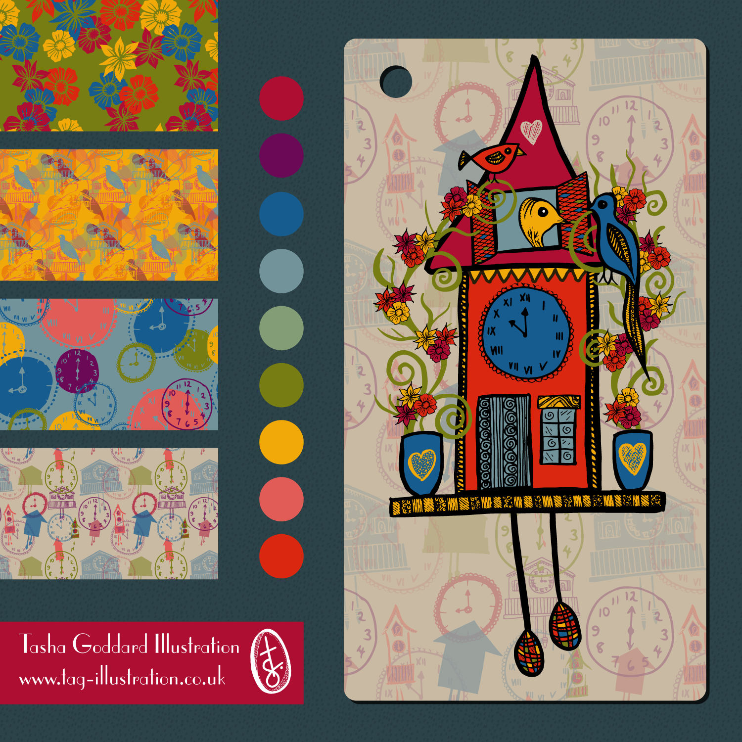


Patterns on mock-ups…


I decided on the layered pattern in the end because I feel it shows me the most and it’s the one I felt ‘right’ doing. I enjoyed the whole three weeks of this, but the cuckoo clocks themselves were more me trying to do what I thought I should be doing, rather than what I wanted to be doing. The fact that I was making patterns in the mini week before finding out what the assignment was I think shows that pattern is definitely where I’m happiest. I do love the hand-drawn cuckoo clock a lot, too, and I’m even fairly pleased with the vector one (which, again, was me trying to go for something clean and neat – vector rather than handdrawn).
One of the things Lilla seems to say a lot (it’s in her book and I’ve read it quoted all over the place; she may well have also said it at some point during this month’s assignment) is ‘People buy your joy’. Well, my joy definitely comes through in the patterns. And in the detailed doodly handdrawing. I would definitely be happy making patterns all day every day – well, as long as got to look at a few patterns by other people, too!
So, yes… my pattern:
Colours
I almost always do a few different colourways of new designs. Quite a few are discarded, or just sit in the computer, chilling out, just in case. But some will jump out and shout ‘pick me!’ and they get to come out to play. I’ve been finding analogous palettes quite appealing lately and find you can still get a bit of pop without needing contrasting colours.
Here are some different colourways of one of the designs from my Brush Florals Collection.


