
Summer School with Make it in Design
The Make it in Design team very kindly provided a fantastic pattern design summer school over the last few weeks. We had three sets of assignments, about two weeks apart and there was a Beginner Track, Intermediate Track and Advanced Track and there was a different brief, but within the same megatrend. I had only signed up for the Advanced Track, having taken Modules 1 through 3 of The Art and Business of Surface Pattern Design, but once I was in the Facebook group (which had over a 1000 members!), I saw people discussing the other briefs and thought I wanted to have a go at them all. Luckily, although registration for the summer school was closed by then, people signed up for one track were able to register for the others, so I got all three briefs.
Assignment 1 – Impulse
Assignment 1 followed the Impulse megatrend, with lots of trend guidance courtesy of Stylesight and additional information and suggestions from Rachael Taylor and the Make it in Design team. Due to dashing off on holiday (to somewhere without wi-fi!) shortly after the assignment came out, I was actually only able to submit to the Beginner Track, but I completed the other tracks when I came home, because I wanted to.
Sketches
I started off drawing lots of sketches and also a bit of mark-making for texture.


Textures
I also tried out some textures using ink and water splodges.


Moodboard
I created a moodboard for the Advanced Track, but didn’t manage to for the others, since I was away. I won’t post it here, as I used photos from Pinterest, as it was just for my personal moodboard. If I were creating a moodboard to share publicly, or for a client, I would use copyright-free imagery, stock imagery and my own images.
Beginner Track – Tropical Paradise
These patterns were created from some of the scanned pictures above. I image traced them, and then created a number of different versions – silhouettes, lines only and ‘cut outs’ (i.e. lines missing) and then laid them out together to fill a repeating tile (a square). I tried some half-drop layouts, but felt that a straight repeat worked particularly well here. I do really like the dark background, as the motifs jump out a lot, but I think the light grey background works better for the tropical feel. This track was definitely my favourite one – maybe because I got to make a conversational print, which is one of my favourites (after florals). (This is all done in Illustrator.)


You can see the other Assignment 1 Beginner Track entries in the gallery.
Intermediate Track – Retro Geometric
I started off with some plain arches within squares, which is quite a pleasing shape (I think, anyway!), but it looked a bit too plain, so I added in some textures using some of the mark-making I had done. (This is all done in Illustrator.)


You can see the other Assignment 1 Intermediate Track entries in the gallery.
Advanced Track – Water Rays
I wanted to include some texture in here, so used some of the ink splodges and recoloured them with the colour palette provided. I used this as a background layer and then overlaid a variety of my wave drawings – again some, as cut outs, some as lines only and some as lines with fills. I varied the scale of the wave drawings and used a standard repeat for some layers, and a half-drop for the larger, top wave. [This was mostly done in Illustrator, though the ink splodges were recoloured in Photoshop.]


You can see the other Assignment 1 Advanced Track entries in the gallery.
Assignment 2 – Confluence
Assignment 2 followed the megatrend Confluence and combined tribal with animal print, neither of which usually appeal to me much (especially the animal print – really, really dislike animal print on clothes, maybe because it makes me think too much about the use of animal skin and fur in clothing!).
Sketches
Again, I started off with some sketches (actually, this time, I also had a pencil sketch page in my sketchbook, with notes – you can’t see it very well from the photo, sorry!), drawing women carrying pots on their heads (something that always amazes me!), trees (I looked up a bunch of African trees), and vases, as well as some decorative motifs and some animal print textures.


Beginner Track – Tribal Shapes
This one was my favourite – again, probably because of getting to do a conversational print. Also, I took a lot of inspiration from my mum’s living room, which she has themed to Africa and which is full of African art, from wooden statues, to masks, to beautifully painted trays and tapestries and paintings. I also love these bright colours – they really sing out to me. I made a tonne of different patterns for this one. I submitted the first one.


You can see the other Assignment 2 Beginner Track entries in the gallery.
Intermediate Track – Animal Print
Here are the animal print patterns I made, none of which really sing out to me, I’m afraid. I submitted the first one, which is a layered combination of three of the patterns, using opacity to provide texture.


You can see the other Assignment 2 Intermediate Track entries in the gallery.
Advanced Track – Tribal Collage
And finally, for the tribal collage brief, I used patterns from the beginner track and combined them in a collage using animal print shapes from the intermediate track. I submitted the first one.


You can see the other Assignment 2 Advanced Track entries in the gallery.
Assignment 3 – Dissonance
Assignment 3 followed the megatrend Dissonance. My favourite was the Advanced Track, which I was immediately drawn to and knew exactly what I wanted to do. I also liked the Intermediate feathers theme, but the Beginner Track really didn’t draw me in at all. I’m not big on jewels (in the sense of gems and diamonds, at least – I love jewellery made from glass and colourful beads and some nice stones, though usually not precious ones). I still completed the Beginner Track, though, but at the very last minute and not with as much thought and effort as the rest. Oh yes, and this time, I actually made mock-ups for the Intermediate and Advanced patterns. Which was actually kind of fun, so I may do it a bit more often. (Though these were wallpaper mock-ups, which are much easier to do than boxes, or mugs and things like that!)
Note: The gallery links for Assignment 3 will go live at some point on Friday 5 September – they are not live at the time of posting.
Sketches
I did some sketches, and a few feather pictures with my watercolour brush pens (though didn’t end up using the latter). I also did some sketches and took notes for the Advanced track tiles, though they were created entirely in Illustrator.


Beginner Track – Jewels
As I said, this was done fairly quickly. I used geometric shapes and opacity to give the feeling of gemstones and then created a somewhat scattered repeat, with a manual flipped half-drop. I quite like this as a simple pattern (perhaps to be a co-ordinate within a collection), though I’m not entirely sure it fully depicts the jewel theme.

You can see the other Assignment 3 Beginner Track entries in the gallery.
Intermediate Track – Feathers
This was fun. It uses my fairly common method of drawing with pen (Pentel Brush Pen and Sakura Pigma Microns), scanning, image tracing, and then The hardest bit was deciding on the colour palette to use! The top one (with mock-up) is what I submitted, and then there are a bunch of other colourways, that didn’t make the pick.


You can see the other Assignment 3 Intermediate Track entries in the gallery.
Advanced Track – Intricate Chaos
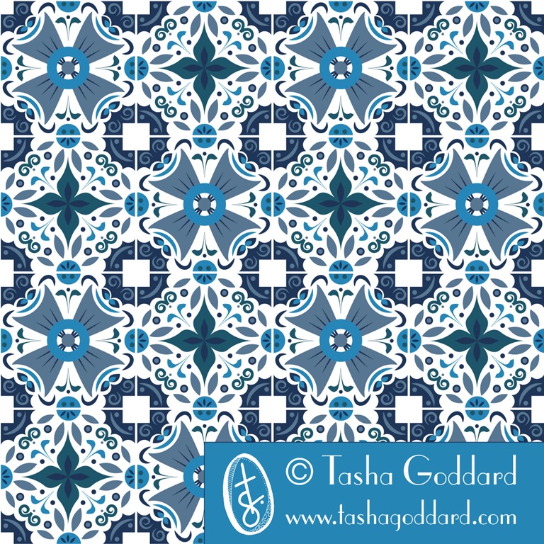
And finally, my favourite – probably of the whole of summer school – intricate chaos. In the brief, there was some imagery (and in the Stylesight trend reports for Dissonance, too) of intricate tile designs and that immediately sprang out to me as what I wanted to do for this. I love, love, love blue and white tiles and thought I would do that throughout (and ended up submitting it), but there were also some very colourful tiles featured in the brief, so i thought I’d also give it a go with a colourful version. I created the designs entirely in Illustrator, first of all creating a grid with vertical, horizontal and diagonal lines, so that I could snap the elements to them. i then created a background that I wanted to repeat on all tiles, that would allow them to fit together, while being actually different designs – so there’s a circle and square that fits together at the corners and circles that fit together on each of the sides – if you look at the mock-up, you can see more clearly how it works.
I created four tile designs, loosely based on my initial sketches. I used a lot of ellipses, and also did a new trick of drawing a line (or a spiral), changing the stroke to a brush or calligraphic style, and making it a big stroke weight, then outlining the stroke, to make it into a shape, rather than a stroke. I made a lot of use of the Transform > Rotate tool as well, to get repeated rotated symmetrical elements. And then I made the tiles into symbols and repeated them to create a four-by-four tile. Once repeated, I made a number of tweaks until I was happy with how they fitted together.
This is what I submitted, but I went through a number of versions before getting there, and got some really helpful feedback in the Facebook group (seriously, the Facebook groups in all these classes are absolutely amazing – everyone’s at varying stages of their careers, with various experience and education behind them; some people are or have been art directors; some work for top design companies or big brands, and everyone is incredibly generous with sharing their methods or suggestions and tips with technology), including added something into the white squares, which I think made a massive difference.


And here’s some bits from the process.




You can see the other Assignment 3 Advanced Track entries in the gallery.
If you’re interested in surface pattern design, do take a look at the courses offered by MIID. I have done Modules 1, 2 and 3 and am hoping to do Module 4 some time next year (depending on the timing of the courses offered). I would say they have been worth every penny and are an excellent investment in your career, if you are looking to make surface pattern design your career, of course!

A Mini a Day: Week 1
So, this was the first week of doing my ‘A mini a day, a letter a day’ and it wasn’t a full week. I definitely enjoyed having a bit of a focus to my doodling and I think, though I still did my normal random (mostly floral!) doodles. I found myself being more drawn to the minis, rather than the letters, but I don’t want to drop the letters, because I do think I could use some improvement (or sophistication, perhaps!) in my hand-lettering. I didn’t really use the letters in any final designs/patterns, though. Maybe I need to wait until I’ve gathered together more of an alphabet.
Here are some of the doodles/sketches (on the first day, I had time to do a bit more, and was able to do some colour sketches, which I then used for the week’s colour palette):
Wednesday: Brollies and the Letter B


Thursday: Saxophones and the Letter X


Friday: Feathers and the Letter T


And the final designs I made last night.


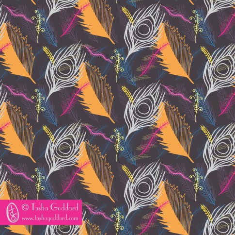


The great thing here, is that I have lots of little icons that I can do stuff with at a later date, if I want to. I didn’t really do any digital icons this time, but I’d quite like to next week, if I can fit it in. I’d love to find a good vector app for my Surface (yes, I can use Illustrator on there, but I’m thinking a more basic app, maybe, for easy playing), so I can do a bit of digital icon creation on the train or sitting on the sofa or in the park… Then again, I do love sketching, so don’t want to let go of that.
Next week: Fruit
Next week, I want to go with a week-long theme, so that each day’s minis can be tied together a bit more and so that I can also have a word (or maybe even words!) at the end, to use in the designs. So, I’m going to go with FRUIT. It conveniently has five letters in it, one for each day (the weekend is for pulling together the minis) and I will do them in order. I want a warm and bright colour palette, so I’m going to go with yellow, orange and red fruit. I will pick one from this list each day:
- lemons
- oranges
- apples (red)
- strawberries
- raspberries
- bananas
- peaches
- pomegranates
- grapefruit
- pears (yellow)
- apricots
- persimmons
- guava
- cherries
- grapes (red)
Of course, next week is the start of a new MATS Bootcamp month, so I will also have a big mini to concentrate on for that. Going to make sure I do at least one page of mine for each day. (How convenient would it be if Lilla picked fruit for this month, though?)
If you’re joining in and have blogged about it (or instagrammed), leave a link here. I might even do a round-up post, if there’s enough of you! Thanks to Chiara and Sareka for joining in on Instagram! Do tag me on Instagram if you join in, so I can give you a shout out (and see what lovely stuff you’ve been drawing).

A Mini a Day; A Letter a Day; A Colour Palette a Week
I’ve decided to do a mini (*) and a letter a day for a while (I’m not going to set a specific time limit – I might do it for a couple of weeks, or I might do it for a whole year).
So, every day, in the morning, I’m going to pick a subject and a letter and whenever I doodle/sit down for 10 minutes with my sketchpad, etc. on that day, I will draw that subject and do a variety of hand-drawn versions of that letter.
Then, on the weekend, I’ll pick my favourites from the week and make some patterns and placement prints from them, using “A Colour Palette a Week”, which I’ll pick on Friday night/Saturday morning. I’m hoping that this will lead to a few natural/spontaneous collections, or at least a bunch of cool designs.
So, today is brought to you by the subject “Umbrellas” and by the letter “B”. I’ll try to share them on Instagram/Twitter with the hashtags #aminiaday and #aletteraday and will do a blog post with final weekly designs. I’ll probably also share it on my Facebook page.

I’ve scribbled down a list of potential subjects in case I get stuck, but I won’t necessarily pick from this list – something might jump out at me.
Potential minis
- skateboards
- flamingos
- meerkats
- strawberries
- vintage telephones
- doughnuts
- penguins
- teapots
- lighthouses
- monkeys
- lions
- diggers
- lollipops
- picnic baskets
- cactuses (cacti?)
- hedgehogs
- feathers
- cocktails
- umbrellas
- saxophones
Feel free to join in, if you want to. If you do join in and blog about it, let me know, and I’ll share your posts, too.
(*)Those of you have done MATS A, B or Bootcamp will know that this is essentially taking one thing/theme and drawing the heck out of it – in Bootcamp we’ve done cuckoo clocks, jellies and dolls/faces, some that people have done in the various MATS iterations include vintage pyrex, succulents, snails.

MATS Bootcamp – Jelly!
March has been all about jelly. I found the topic a little less inspiring than last month’s cuckoo clocks, but still ended up having fun with it (despite a crazy ‘other work’ month that saw me with very little design time on my hands). Fortunately, drawing, painting and making pretty patterns are all part of how I relax, so every spare moment I will have my head in a sketchbook, looking at Pinterest for colour inspiration or having a play in Illustrator. I even fill my notebooks and work diary with doodles drawn while waiting for files to upload or computer processes to complete.
The start of the process was the mini – jelly moulds!
I did some sketches:
 And then I played with putting them into Illustrator and colouring them.


I wasn’t hugely excited by what I’d come up with, though.
Then the assignment came and it was bolt fabric. Which meant patterns… Hooray! Patterns are totally my thing. I love, love, love making patterns. But I didn’t have time to really get into it and was thinking about different ideas and not using my motifs from the mini. Then Lilla’s surprise – which was about colour again – came and there was a nougat palette which I felt inspired to play with:


This was definitely feeling a lot better and I was happy with the motifs and the layering and the repeat, but the colour wasn’t quite singing to me. So, then I had a play with neutrals, which was the other part of Lilla’s Week 3 surprise. From what I’ve read about MATS A and MATS B courses, Lilla is very big on having neutrals in a design.
I played with some (new acrylic) paints:

And then I played in Photoshop (strips of colour, overlaid with strips of translucent (at different opacities) white and black. And then I picked out the colours that really sang to me from this playing. And came up with this colour palette:

It feels like Spring and Juice and Bouncy Jelly. I love it!
In fact, it occurred to me that the colours were really similar to some flowers I bought the other day:

This is what I submitted:

And here are some other colourways:


(Look at the collection on the main page to see the co-ordinates in their full glory.)
We’re taking a break for April, as they’re running MATS A and B. This is probably a good thing for me, too, as ABSPD Module 3 starts on Monday, so I’ll be pretty busy with that!
Please contact me if you’re interested in licensing any of the designs on this site, or commissioning new ones.

MATS Bootcamp – Cuckoo Clocks
 I am so very glad that I signed up for the Make Art That Sells Bootcamp, from the awesome and inspirational Lilla Rogers. It’s a long-term (runs over a number of months) portfolio-building session – not quite a course, but there are lots of course-like aspects. You get a mini the first week of a month, then an assignment, then a little something special (could be some tips, an interview, some other tidbit) and then you get to share your completed assignment on the class gallery, which is public and promoted widely.
As with the ABSPD modules I’ve taken, one of the best aspects is being part of a group of creative people (in this case, a Facebook group). There is a really wide range of experience in the group, with a fair number of established and successful designers as well as quite a few beginners – and the full gamut in between. People share what they’re doing for the minis and assignments (you don’t have to, but it’s really useful to do so) in the Facebook group and get feedback. Because there are so many very experienced designers in the group, the feedback is often really useful (e.g. suggesting a tweak to a design, a different direction to explore, a colour change, etc. etc.), but always very supportive. The last few days we’ve all been sharing our finished assignments (or close to finished) as the deadline for submission to the gallery is tomorrow. The gallery should go live next week and it will be really exciting to see all the designs collected together. What we’ve seen on Facebook has been truly awesome!
I went round and round in circles doing my assignment (cuckoo clock inspired design for phone covers), but had great fun doing it.
This is what I submitted in the end:

And here’s how I got there:
Sketches…


Colour and pattern…


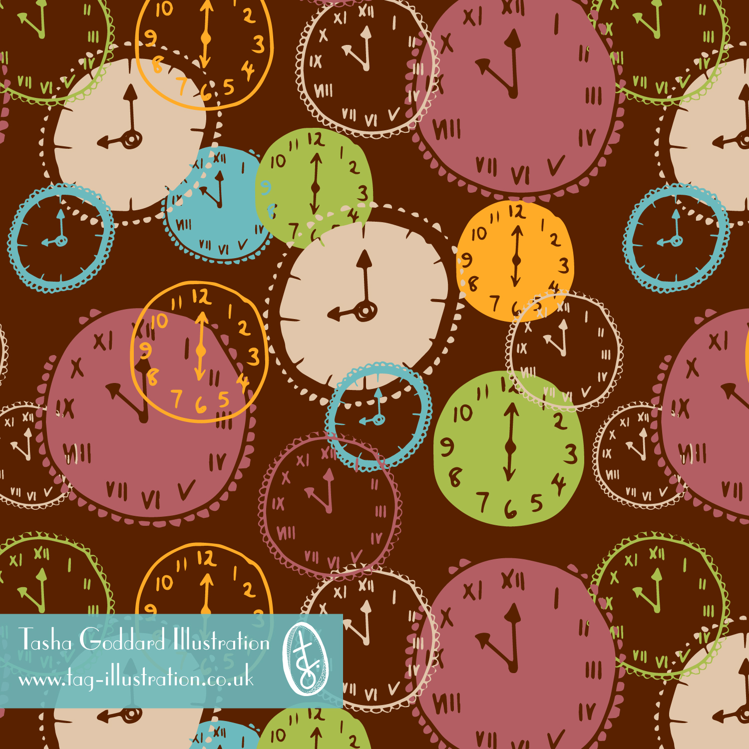

Different colours:


Cuckoo clocks and mock ups…
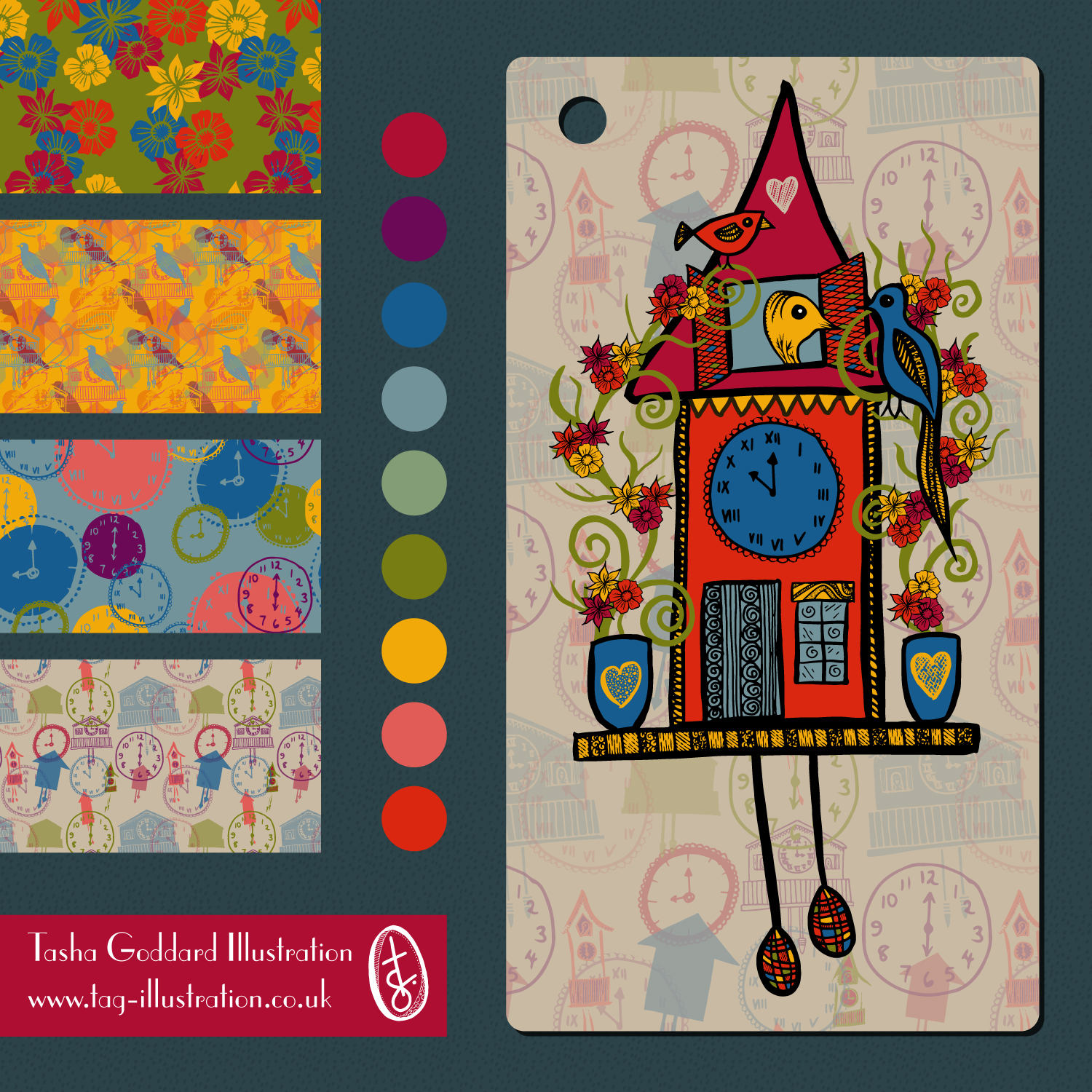


Patterns on mock-ups…


I decided on the layered pattern in the end because I feel it shows me the most and it’s the one I felt ‘right’ doing. I enjoyed the whole three weeks of this, but the cuckoo clocks themselves were more me trying to do what I thought I should be doing, rather than what I wanted to be doing. The fact that I was making patterns in the mini week before finding out what the assignment was I think shows that pattern is definitely where I’m happiest. I do love the hand-drawn cuckoo clock a lot, too, and I’m even fairly pleased with the vector one (which, again, was me trying to go for something clean and neat – vector rather than handdrawn).
One of the things Lilla seems to say a lot (it’s in her book and I’ve read it quoted all over the place; she may well have also said it at some point during this month’s assignment) is ‘People buy your joy’. Well, my joy definitely comes through in the patterns. And in the detailed doodly handdrawing. I would definitely be happy making patterns all day every day – well, as long as got to look at a few patterns by other people, too!
So, yes… my pattern:
Colours
I almost always do a few different colourways of new designs. Quite a few are discarded, or just sit in the computer, chilling out, just in case. But some will jump out and shout ‘pick me!’ and they get to come out to play. I’ve been finding analogous palettes quite appealing lately and find you can still get a bit of pop without needing contrasting colours.
Here are some different colourways of one of the designs from my Brush Florals Collection.


Studio envy
One of my biggest wishes (apart from world peace, universal education and an end to hunger, of course) is to have a studio in the back garden. At the moment, I make do with drawing and designing at my desk, where I also do my other job of project managing educational publishing projects.

I also often do some drawing at the dining table.

Or while out and about – in the park, in cafés, at the soft play centre…
One day, I’ll have a studio in my back garden, but in the meantime, I’ll make do with wherever I can lay my sketchbook.
